A little bit of UI polishing?

I’ve been wanting to post this since the new UI got out, but did never quite find the time, until today. I’ve always been impressed with Audirvana’s sound quality, a little less with the UI and whilst I see certain major improvements in the new design, I also see a number of areas that could benefit from a little bit of polishing. One such area is the size and Z-index of some UI elements.

I don’t think much is needed to suddenly bring more content to the screen, which is what I think many of us are after, especially on smaller screens like a MacBook Pro Retina 13-inch (I don’t have any larger screen at home and it does quite suffice even for Xcode).

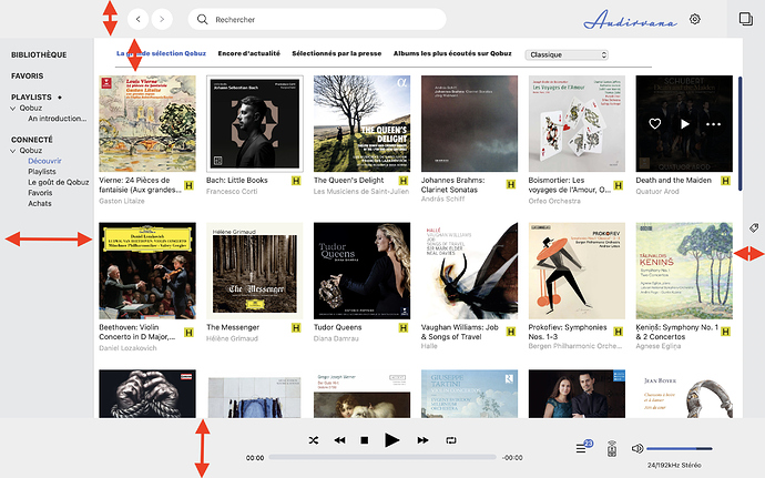
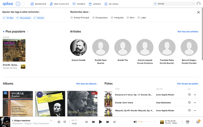
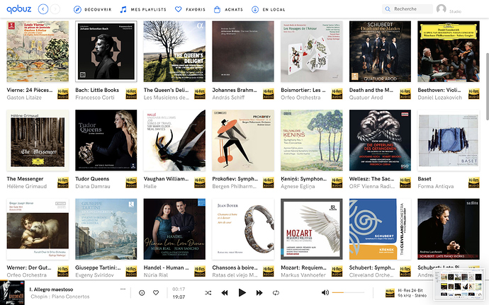
I know people tend to have their own ideas of what looks desirable and what is rather less desirable, so I decided to share 2 screenshots of the same audio library looked through the prism of 2 different apps. One app is Quobuz, and the other is… Audirvana.

I’ve indicated with red arrows where I think one of the app uses a little too much (often blank) screen estate, compared to other which is more compact but no less professional, I think. I’d love to see these areas become denser in Audirvana.

To try to make a fair comparison, I’ve size the albums to be (roughly) the same in both apps. I’ve also used the same column widths. I think the results speaks for themselves. One app shows 40% more albums that the other ( (3*7)/(2.5*6) ).

I’d love to hear what Damien and the team think.
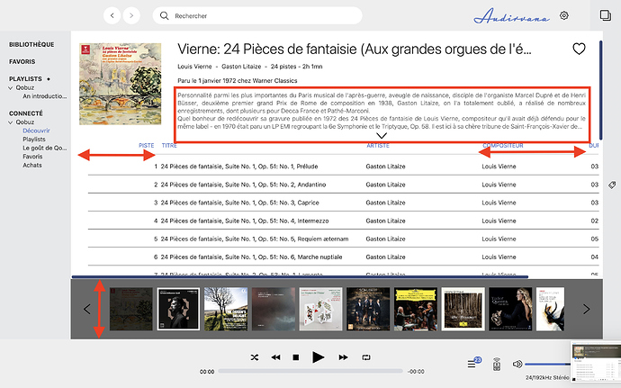
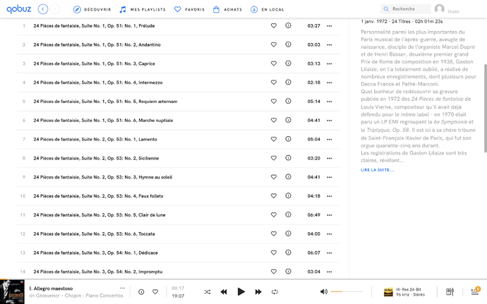
Let’s look at another area where the UI might benefit from a little extra polishing: the track view. The header stands out beautifully in the Qobuz UI and I think the text fits more naturally in a vertical rather horizontal orientation (and no need to press the arrow to see more, you just scroll), especially since Audirvana does not quite seem to use the extra available horizontal space to fit more track columns.

Also, on my screen the multiple albums tab is preventing me from seeing additional tracks, which is really what I’m after in this view. And why does the Track column have to be so wide in the first place? The other columns would immediately benefit from its reduction in size.

1 Like

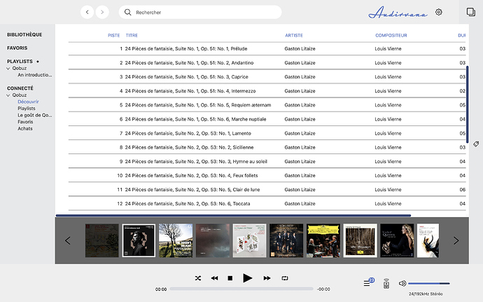
And finally, the same track view without the headers. Again, I think the screenshots speak for themselves. One of the app shows twice as many tracks as the other.

Of course, Audirvana provides extra features in this view. But could not the multi-albums tab be collapsible or a user preference? And are the column headers really necessary, or do we not know what they stand for by heart and is it really that bad if they disappear from the view when scrolling?

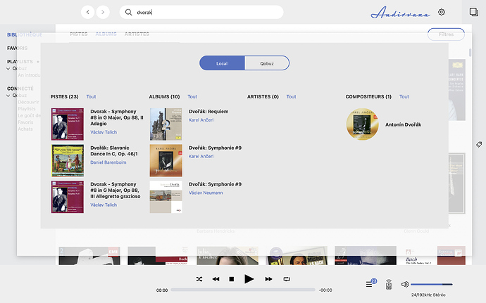
Last but not least, the search window. As we have all know, search is quite important and needs to be accessible, fast and accurate. It is especially import that the UI presents the results in a nice and easy to understand fashion.

On that score, I think the Qobuz search results window could do better. It crams many different UI elements together without a very clear or easy to understand structure. But at least it does one thing right in my opinion: the window occupies the entire space available and does not feel modal (although it is). You just feel that you are in a different tab and that’s it.

I do quite like Audirvana’s clearer structure, although maybe some different background or the presence of a separator would make the different columns stand more from each other. But I’d give just much more screen estate to the search dialog and make it feel less like a dialog, especially since the borders are transparent and let the underlying content show through.

Again, I do really enjoy Audirvana and I would be thrilled if it could get even better - not just the audio, which is the reason why we adopt Audirvana in the first place - but also the UI. I don’t think we’re quite there yet, but that it would not take much effort, now that the underlying UI framework has been changed, to make it just absolutely perfect.

1 Like

Hello @gemow,

Thank you for your feedback, I will answer your different remarks by responding to your posts on at a time.

For your first screenshot, have you noticed that you can resize the size of the source on the left?

Every column in Audirvana can be resizable, I know it’s not obvious because there is not separation between the column, we will fix this kind of UI issue in a future update of Audirvana.

Hello Damien. Yes, I know the left hand pane can be resized (but not quite completely hidden). I tried to do a fair comparison between the 2 GUIs. To do that, I decided to size the albums in both apps to be roughly the same. That meant using the left-hand pane as padding material. There was an other option which would have been to eliminate as the left-hand pane as much as possible. But that would have been an apples and oranges comparisons, as the albums would have had different sizes in the two apps.

As for the columns, yes, I know they are resizable, and they’ve remembered between invocations, which is neat. An improvement would be for the size to be a little smaller in some cases.

I know users can be picky about UI choices. When the new Quicken for Mac when out a couple of years ago, there was a sudden fury of comments from users who complained about the, in their opinion, poor use of screen estate with lots of empty spaces between UI elements. The initial reaction of the QM team was to stick to their initial design, but that prompted even more fury from people with smaller screens that had been able to see more data in previous version. Eventually, the QM team decided to implement 3 UI models: Large, Normal and Compact. That seemed to satisfy most of the user base.

It’s a fair choice, we will try to bring something like this in a future version of Audirvana.

I firmly agree with @gemow. I have been complaining about the lackluster GUI in Audirvana 3.5, since it came out, hoping that it would eventually be improved, that perhaps some user preferences could be added, to bring back the old column view, from previous versions, to make the horrible, persistent, space-hog headers go away, to avoid selecting multiple albums/ artists, without clicking on Command, etc.

I eventually simply downgraded back to version 3.2.20. Sure, the sound isn’t quite as good, but honestly, my use of Audirvana has increased by about 1000%, since doing so. I couldn’t stand fighting with that godawful 90’s Napster Knockoff Windows view any longer.

I hope Audirvana gets a serious, thoughtful GUI update someday. If it doesn’t, I will not be getting burned on future versions, the way I was burned with version 3.5. I will simply move on to something else, instead.

Thanks, @gemow, for the detailed, insightful feedback. Hopefully, @Antoine listens to us and the many other users who have been deeply dissatisfied with the UI regression, intrinsic to version 3.5.

For now, the best advice I can give anyone who is dissatisfied with the GUI is to downgrade. It is very simple, and, if you’re on Mac OS, it works just fine with Catalina. It made me love and appreciate my digital music collection (all 6 TB of it) all over again, the same as when I first purchased Audirvana Plus in 2016.

1 Like

Now that UI issues have been raised - many of the suggestions I heartily agree with - there remains one issue that really annoys me (not just with AV but with all similar apps it seems - iTunes is the worst. In album view all but short titles get truncated, so that they can’t be read at a glance (eg: Beethoven: Symph…). Is it so difficult to implement a pop up flyover comment box when the mouse cursor passes over the album artwork?

1 Like

This topic was automatically closed 375 days after the last reply. New replies are no longer allowed.