While I appreciate the way AS integrates my local library and Qobuz content, sometimes I find it unduly clutters the screens when browsing my local content.
Summary: When I click on Local-Albums or Local-Artists I am mainly interested in the contents of my local library. Mixing in Qobuz content creates undue clutter in some cases. So my request is to use the same screens I see when I have disconnected Qobuz for my Local library navigation. But keep the links so I can click on the artist to jump to the full Qobuz artists presentation.
Details:
Case in point: I have a number of “one-hit-wonder” tracks; that is, only one song from an artist. (I don’t buy single tracks anymore, it was a left over habit from before I fully embraced the idea of streaming).
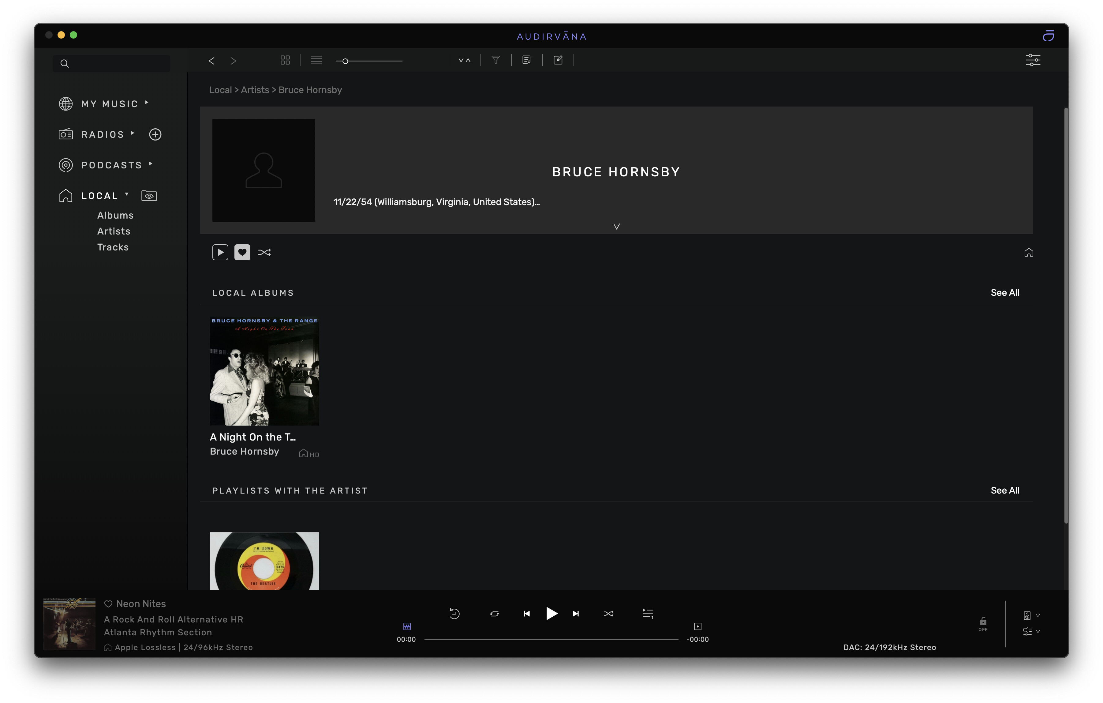
I enjoy browsing through my local library including visiting these singles from time to time. When I click on Local - Artist - Select Bruce Hornsby for example here is what I see:
Clicking through the one album I see my one track:

It’s a nice, simple screen.
Here are the same screens with Qobuz connected:
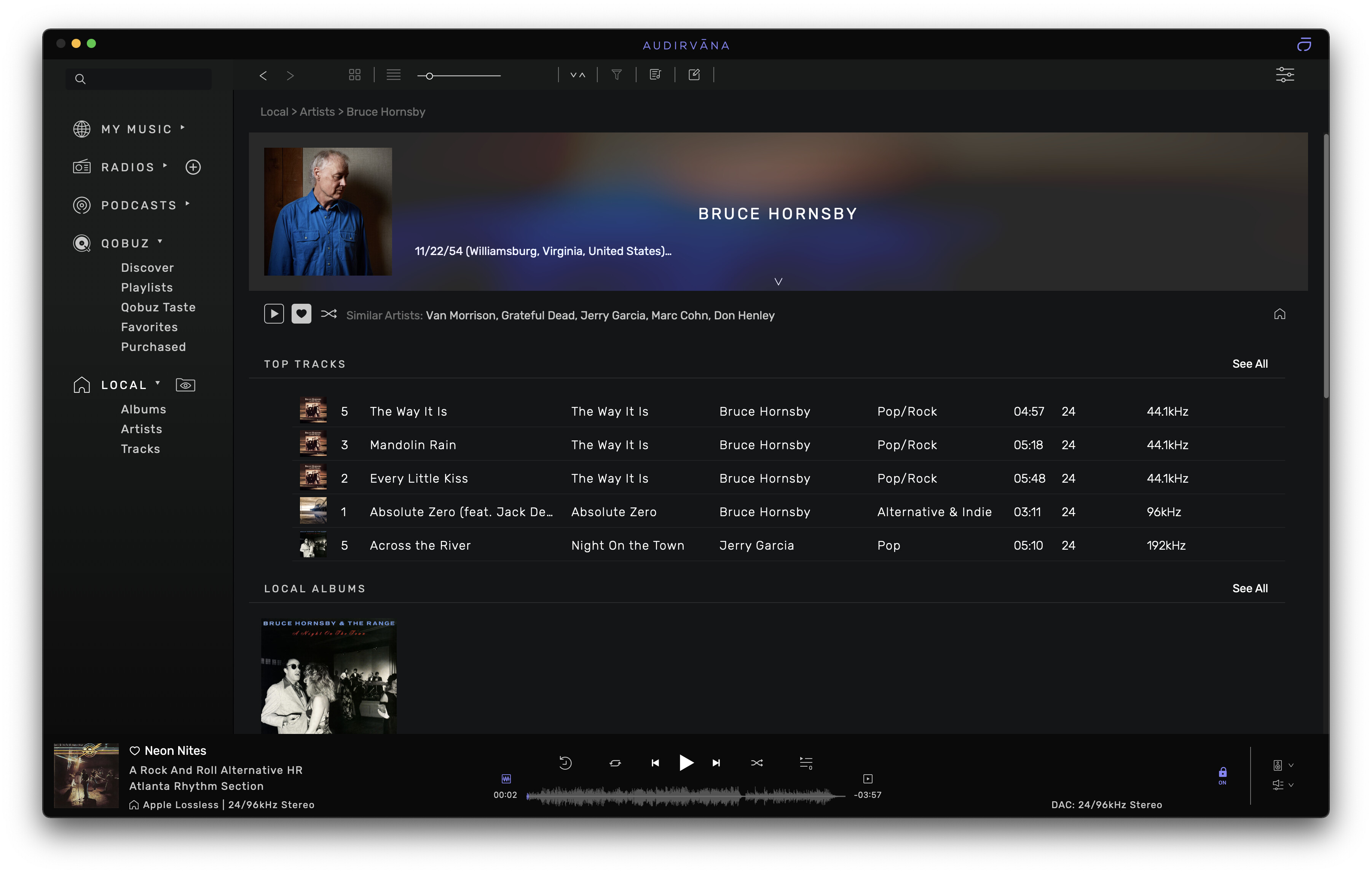
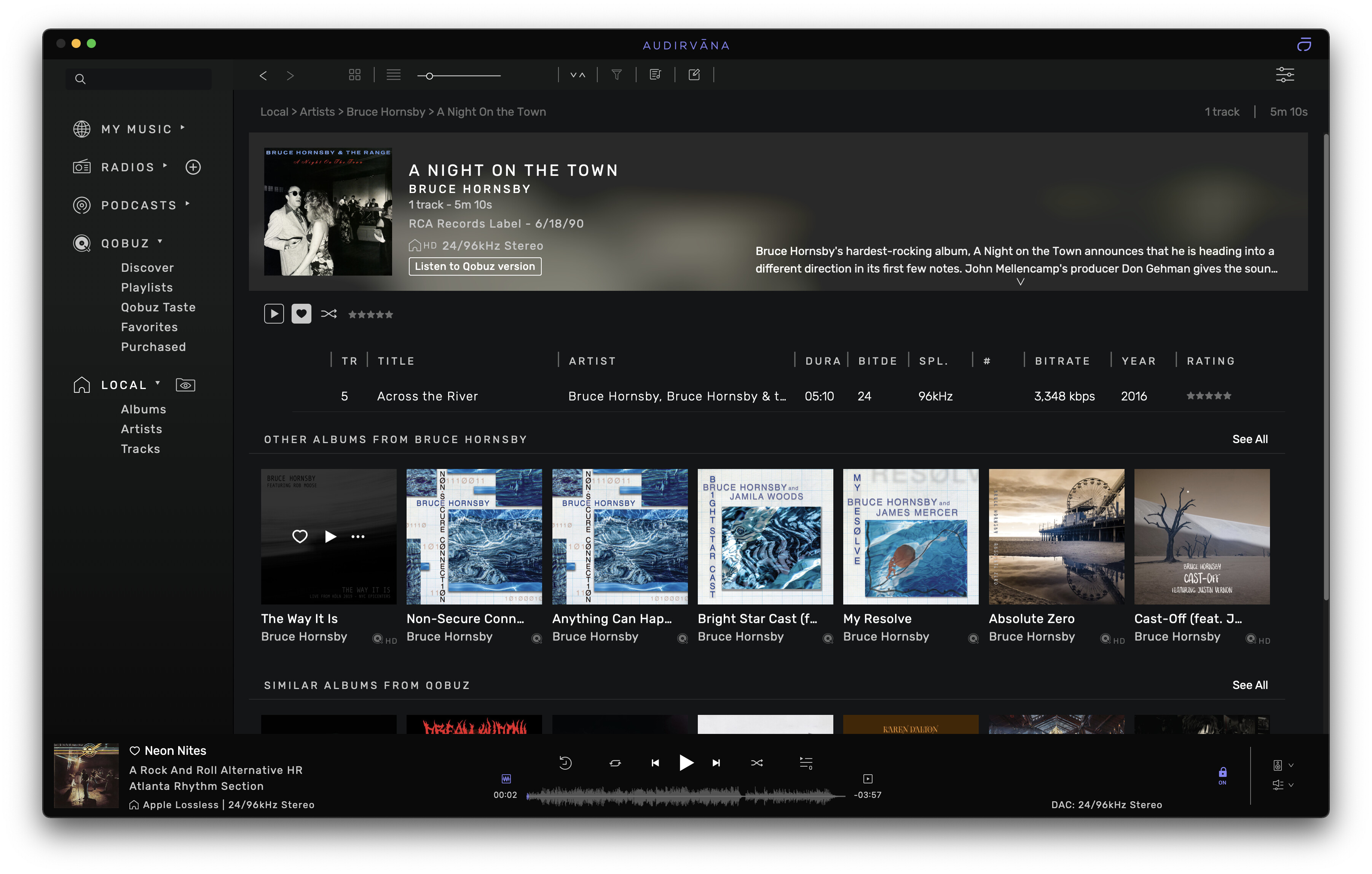
While this is a great way to explore new music by an artist, that isn’t what I’m mainly interested in when I’m browsing my local library.
So I’m suggesting that the screens I see when I select Local-Albums and Local-Artist be the same simple screens I see when I have Qobuz disconnected. But also preserve the feature that allows me to see the full blown Qobuz+local screens when I click on any of the Artist links.