If selected, album sorting criteria “by year” is currently NOT honored in “artists” view, but it should be.
Also, in album view, it would be useful to show year.
Another major issue is inability to sort by genres. Symphonic music is not looking good together with rap or something. Of course, smart playlists could be used but those still does not give full advantage of what library view does.
Option to create several libraries is required.
Finally, in “now playing” view, there is not enough space for tracks, and this space is eaten by the terrible bar with other albums. It is bad, because there are no quick sorting options. May be good for somebody with 5 albums in the library but this design is bad.
I prefer sorting albums chronologically in descending order, everywhere, and would like to see the (original) release year in every possible place, from lists to now playing screens, etc…
I wouldn’t mind if the release year was shown after the album name in brackets - just to provide an example; Not a complete date though, just the year to keep it compact and uniform.
Several libraries would be most welcome, but it’s about as large a change as possible, it’d take a lot of work to implement. This should probably be separated into it’s own specific feature request (unless one already exists) to gather more weight and to be easier to track.
That now playing -view issue you might clarify - at least I can’t follow what you mean. Which client, what view? What bar and other albums? Best would probably be to take a screenshot and annotate it, if you can. I think it’s safe to assume that quite a few of us have “a bit” more than 5 albums in our libraries, so that can’t be it.
Sorting albums is a bit tricky thing. For example, I like my rock music sorted exactly like you suggest - by artist, then by year. However, with symphonic music, I want them sorted by composer then probably alphabetically? Even, maybe I want symphonies and operas sorted separately? It could be possible, but difficult to imagine how to accomplish it with filtering, and looks like separate libraries it easier solution here.
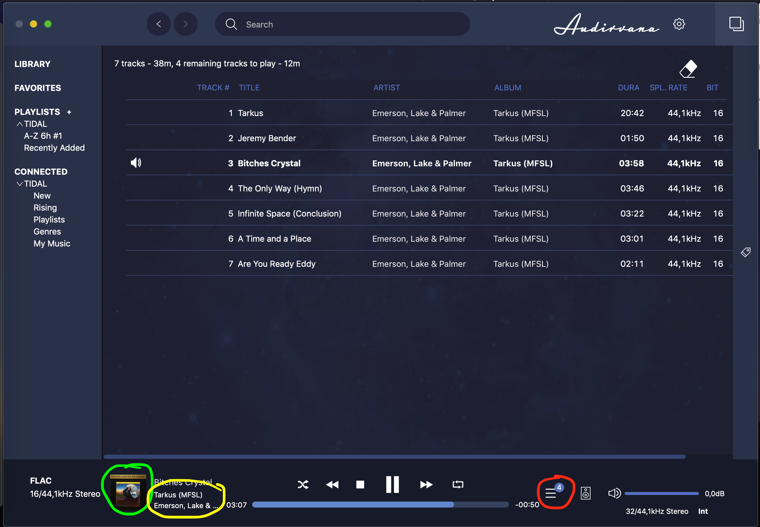
Regarding “now playing” view, I am talking about the album list, circled in red. Looks like a slideshow of random albums, totally unnecessary.
So, you’d like to have multiple libraries with independent sorting …
To work intuitively, first the whole current UI for sorting, in the preferences, would need to be replaced with sorting options in the views themselves. Hiding sorting in the preferences part of the application is unintuitive and slow, so this would be a very good improvement. After this, the sorting mode could be stored either globally or per library - but even if the per-library bit were not to happen, the improved sorting convenience might be enough.
–
Now I get the now-playing issue… That’s what I’d call a single album view. There’s definitely something funky about it, sometimes I get that semi-random album bar, sometimes not; The inconsistency means that there’s a bug somewhere. Whether the whole feature is welcome or not - well, I’d certainly also toggle it permanently off, the Audirvana UI already wastes so much space, at least on a laptop screen - and my mbp is a 15" model, things must be even worse with smaller ones.
This below is what I use as the now-playing-view, activated by the red bit. The green thingy launches a small album art viewer mode and the links in the yellow part can get to the artist or the album - which sometimes has that bar, other times not…
I’d like a “now playing” view which would stay in the original window and also be nice in fullscreen mode. In fullscreen, it could feature all the controls, good sized album art and the play queue (with just key details/columns) all in one. I’d prefer to activate it by clicking the album cover (green bit), which currently switches to the compact player.
Right. Filtering options directly in the window would be already a great improvement. It would be something like a column viewer (could be just drop-downl lists to save space) and wouldn’t take long to adjust sorting as desired. Would be good enough for most, even without multiple libraries.
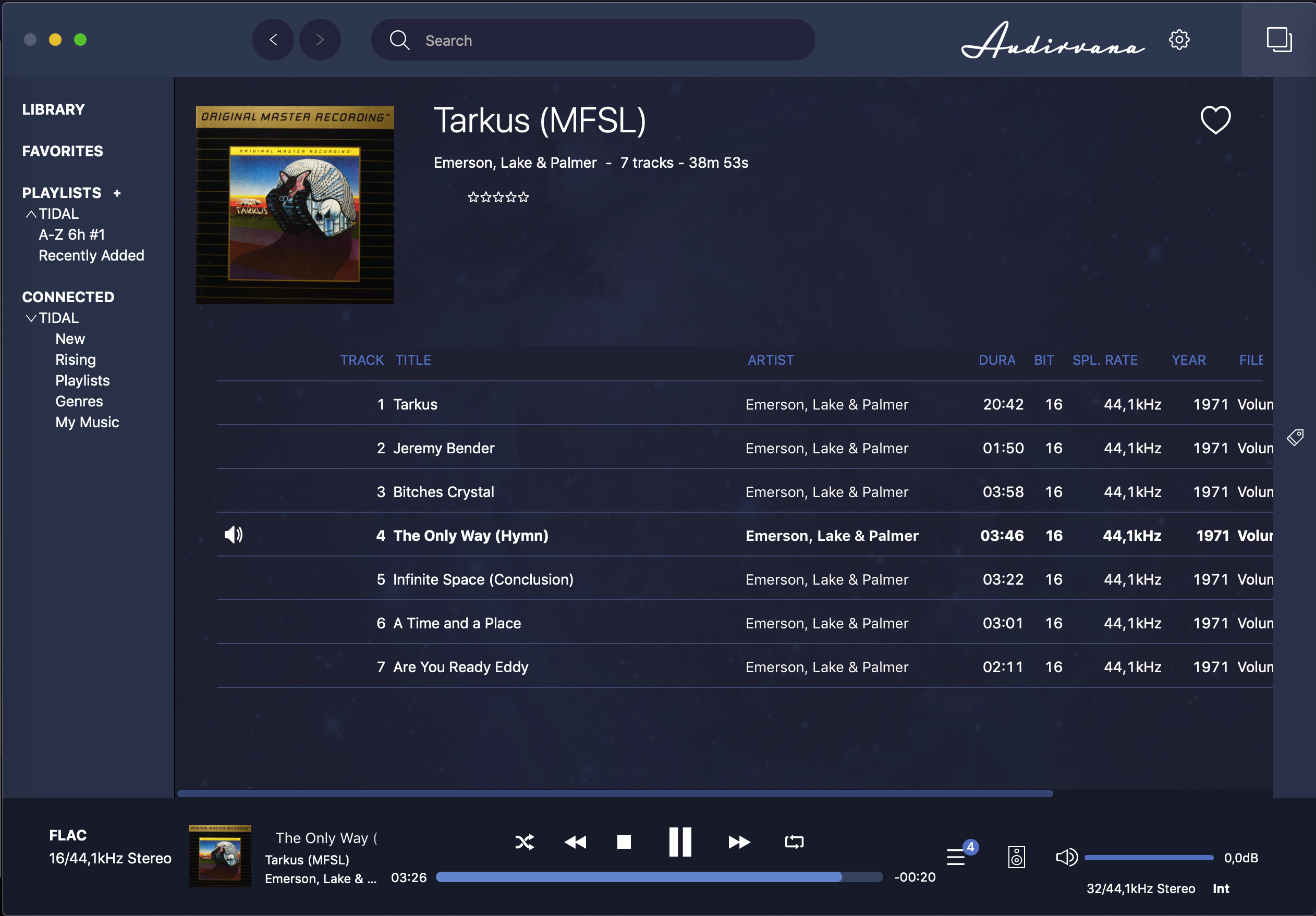
“Now playing album” with the bar looks much better, sadly no reliable way to get it. Even better if only tracks were scrolling while title and artwork would stay visible.