This is not a problem. An app could use any suitable icon, but it is a little visually weird when Audirvana align with the other apps with round icons on the Dock. As you can see in the screenshot, Chrome icon is a little larger than the apple apps icons, but Audirvana icon is much larger than the the other icons.
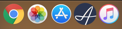
i think the effect of the icon being larger is exaggerated by how large the cursive ‘A’ is within the icon. if you compare the other icons, the Photos and Apps and iTunes image within the circle is much smaller than the cursive ‘A’. i think that makes a big difference too
FYI – you can customize the icon that displays for any file (including application) on Mac OS.
first, i downloaded the old ‘Audirvana Plus’ icon – open this in preview and copy it.
then, locate the Audirvana application file on the desktop, hit 'cmd I" to show information for that application – then click on the small icon image at upper left– then paste, and the icon will change.