Hoping the interface (Windows version) is still in development, as it is pretty difficult to use. For example:
LOCAL → ARTISTS displays round circles - the List View is inoperative. You also can’t start typing an artist name to ‘jump’ to that artist, which is how most list controls function.
Once you double click a circle for an artist you can display the Album/CD titles for the artist. However, you can’t display the list of songs for those Album/CD titles - clicking the See All text only removes the PLAY|LOVE|SHUFFLE icons from the screen. You only have the option to click the CD image to display a PLAY button to play songs for a single Album/CD title. Very frustrating.
Displaying playlists as a separate docked window consumes far too much screen space; the previous Audirvana interface displayed playlists within the existing left portion of the screen, which conserved space for the listbox control to display song title information.
I could continue, but will stop here. I find the previous Audirvana interface far more intuitive than the new Studio version, and even it was pretty difficult/limiting at times. Trying hard to embrace this Studio version, as the sound quality of Audirvana is far superior to competitors, but the interface is really getting in the way of an enjoyable experience.
Agreed. I’m trying out the software (Mac version) and I am also super confused why the list view doesn’t work for Artists yet it is enabled for Album and Track. After being used to a decade plus of iTunes’ straightforward Artist on left/Album on right format I don’t think I can pay $70/year for software that doesn’t give this basic option. It’s a shame cause I like a lot of the design but the lack of list mode is a no go for me.
Greetings from Albuquerque. Yes, I know I can move the window, but the point remains that the 3.5x version displayed playlists in a much cleaner/less space consuming format. Further, when you select an Artist as you depict above that you still cannot display a list of the songs - it will display album thumbnails or circles that you can’t select a subset of songs to shuffle through.
I was able to display the Windows version ala your MacIntosh version to display the artists… which fixes that problem as I can shuffle play the artist (which is an important thing for me, as I typically listen to music either by Genre or by Artist). Thank you for your help!
I would like to be able to use the keyboard to select the Artist though (I’m a keyboard person -vs- mouse)… for example, when in Artist mode if I started typing TRI it would move a highlight bar down to TRIUMPH automatically -vs- forcing me to use the mouse to drag a vertical scrollbar downwards…
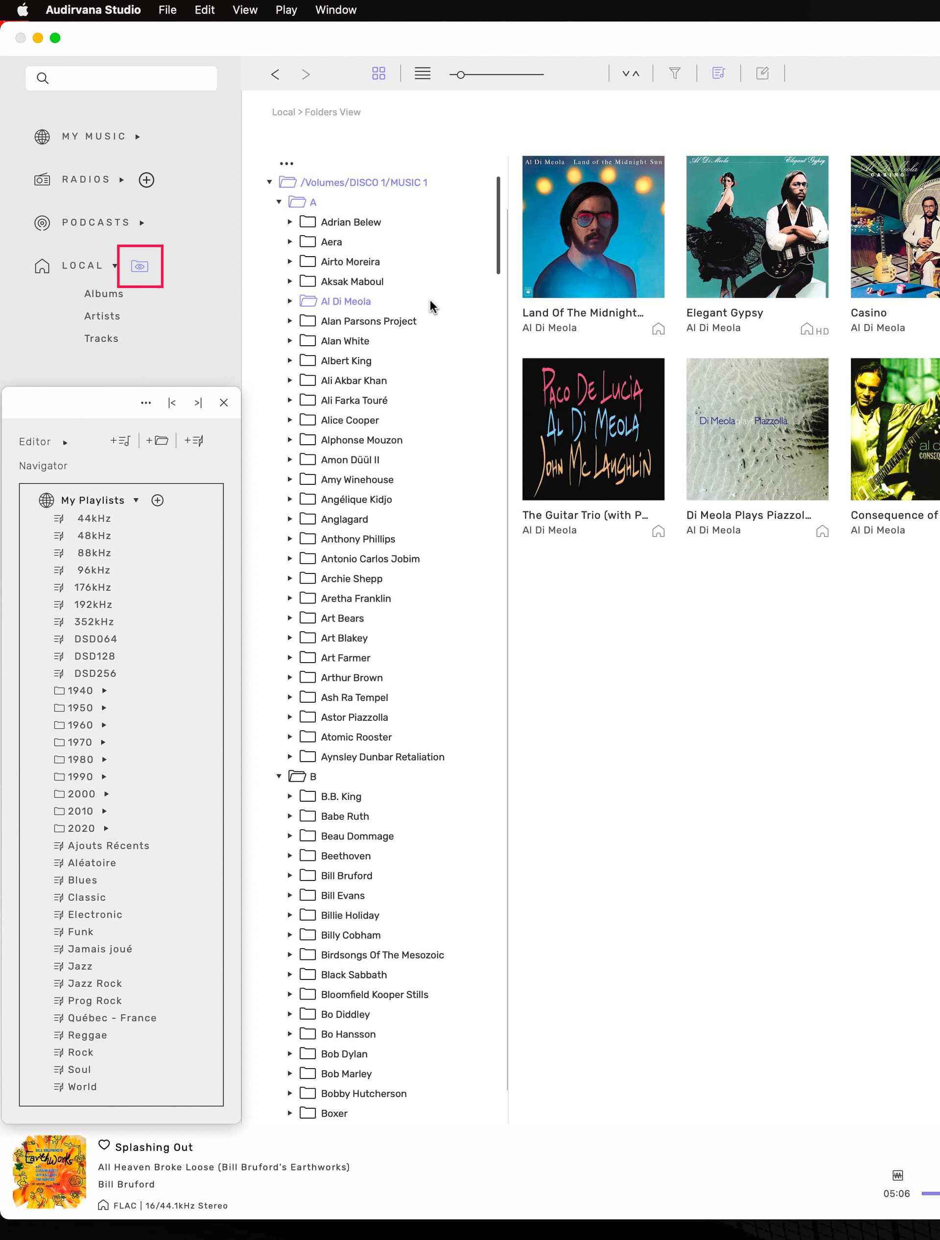
if you have clicked the first folder like in my picture, you can use your keyboard arrow down to go down or vice versa… enabling media key in Studio prefs. Not fastest way but the only one i know…
the tree view that i saw you wasn’t existing couples of month ago… asked by many for long…
keep your fingers crossed
Only typing can be done in the search fiels top left… then, you’ll need a mouse to select
what i love with the tree view for me,
is that when i click Zappa, the albums of him
are in the right order… first to last, not like in Artist view when they are in reverse… last to first,
and without having to click ‘See All’ to see them all !!
In albums view they are OK too but you have to scroll all albums to see them in right order…
i have also some fingers crossed