Column Browser like iTunes used to have missing in Audirvana / Feature Request

@AdminSysteme I hope the keyword or category fits – if not: feel free to move!

–––

Apple transformed the iconic “iTunes” into “Music” with the new Catalina (macOS 10.15). Unfortunately Apple reduced the functionality in many, many areas (good summary on this at KIRKVILLE – my main issue is: “Music” lost the COLUMN BROWSER (please see screenshot attached) which I (ans many others used to navigate through quite huge iTunes libraries for years.

Unfortunately Audirvana lacks this valuable kind of display totally (as well) – would love to see such a “simple” column based listing!

Best, Lorenz

1 Like

Instead of a top column browser, Audirvana 3.5 uses Filters on the right hand side. Unfortunately this is not very practical like a column browser or Filter on top of the track list view.
(Audirvana 3.2 uses a nice column browser on top of the track list view.) I hope very much that the Filters will come back to the top - a lot of empty space is not in use up there. And more Filters could be mounted without the need of scrolling.

1 Like

@Alberto – thanks for your input. Yes – I use this filer feature. It’s fine if you know what you are looking for but it will not work well if you try (e.g.) to troubleshoot sorting issues, meta data spelled differently for the same artist etc. A real list view would be so cool. Crazy – I thought that Audirvana dis have that. Bud didn’t find hot in 3.5 – too bad 3.2 is gone for me (with regards to that function alone). But hey – Audirvana could the easily re-introduce that feature vor an upcoming release.

2 Likes

It would probably be fine with filters, if under certain conditions filtering didn’t crash Audirvana (same as going to settings during playback sometimes does). Apart from that, column browser is way more convenient than filters in current implementation.

1 Like

Yes, I agree. I hope very much that Column Browser comes back.

2 Likes

The lack of the column browser, along with the general, godawful clumsiness and immoveable wastes of space, in the Audirvana 3.5 interface, eventually led me to downgrade back to Audirvana Plus 3.2, a few weeks ago. I was pleasantly surprised how easy it was, and, once I’d deleted version 3.5, all functions of 3.2 worked perfectly.

I’m now back to using version 3.2.20, and I haven’t enjoyed music so much on my Mac, since before I made the mistake of “upgrading” to the hot mess that is Audirvana 3.5.

The column browser was one of the best, most functional features of previous versions of Audirvana. Not only are the filters located horribly and difficult to use, the column constantly resizes itself, and the built-in assumption that clicking on the name of a second Artist or Album means the user wants both selected is enough to suck one’s will to live, when navigating a large music library. Ever try to scroll back up to deselect Bob Dylan, when you’ve just selected Thelonious Monk, and you have a 3 TB music library? Ever try to do that, in a tiny, square window, where you can’t even read the full names of many artists in your library? If the answer is “no”, to either, you haven’t been using Audirvana 3.5!

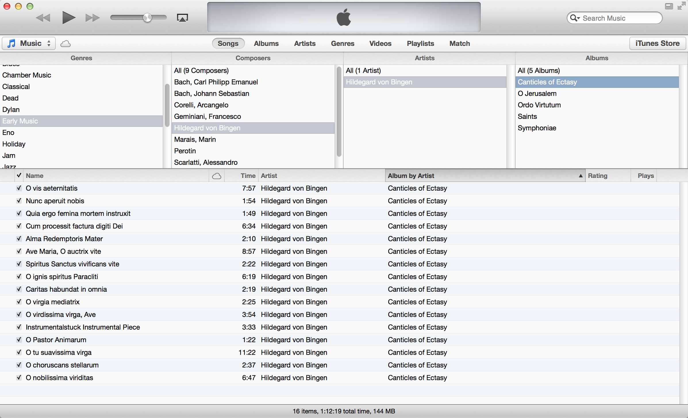
Interestingly, Apple did bring back the column Browser, in Apple Music, and, much like in prior versions of Audirvana, they actually allow as many as five different columns now! If only Audirvana could learn a few things from Apple, with respect to basic functionality (not to mention the ease of editing metadata, for which iTunes/ Apple Music is still the best software around).

Long story short, I completed a survey, about Audirvana, a couple weeks back, and I made it very clear that, unless the buggy, horrendous interface is rectified, or at least made infinitely more customizable than in its current state, I will not be paying for further upgrades. I got burned on the latest version of this software, and I won’t let it happen again.

More users, like us, who are unhappy with the Vintage Napster interface of the current iteration of the software, should be more vocal about our opinions, both here and in outside forums. The audio quality, when using Audirvana to play music on a Mac, is unparalleled, but the user interface is just shameful and badly needs to change.

1 Like

@GaseousClay Thanks for your contribution with this detailed report! I very much agree with your statements, hopefully @Damien will hear us finally.

2 Likes

@Alberto, here we are, almost two years and two new versions of the software later, and people like you, @Lorenz, and I are still shouting into a void. Audirvana, meanwhile, continues to leave money on the table, as, without this feature, I will continue to use Audirvana Plus 3.2.20, rather than buy or subscribe to any further “updates” that lack the functionality of previous versions.

Do I understand you correctly? Still no top Column Browser available?! (I did not check AO until now).
The reason for this is hard to understand, even Apple Music understood that this feature is needed and brought back the Column Browser.
That’s why I continue to use Swinsian or Apple Music for the library and AV 3.5 Play Queue for listening.

1 Like

This topic was automatically closed 90 days after the last reply. New replies are no longer allowed.