Bonjour,
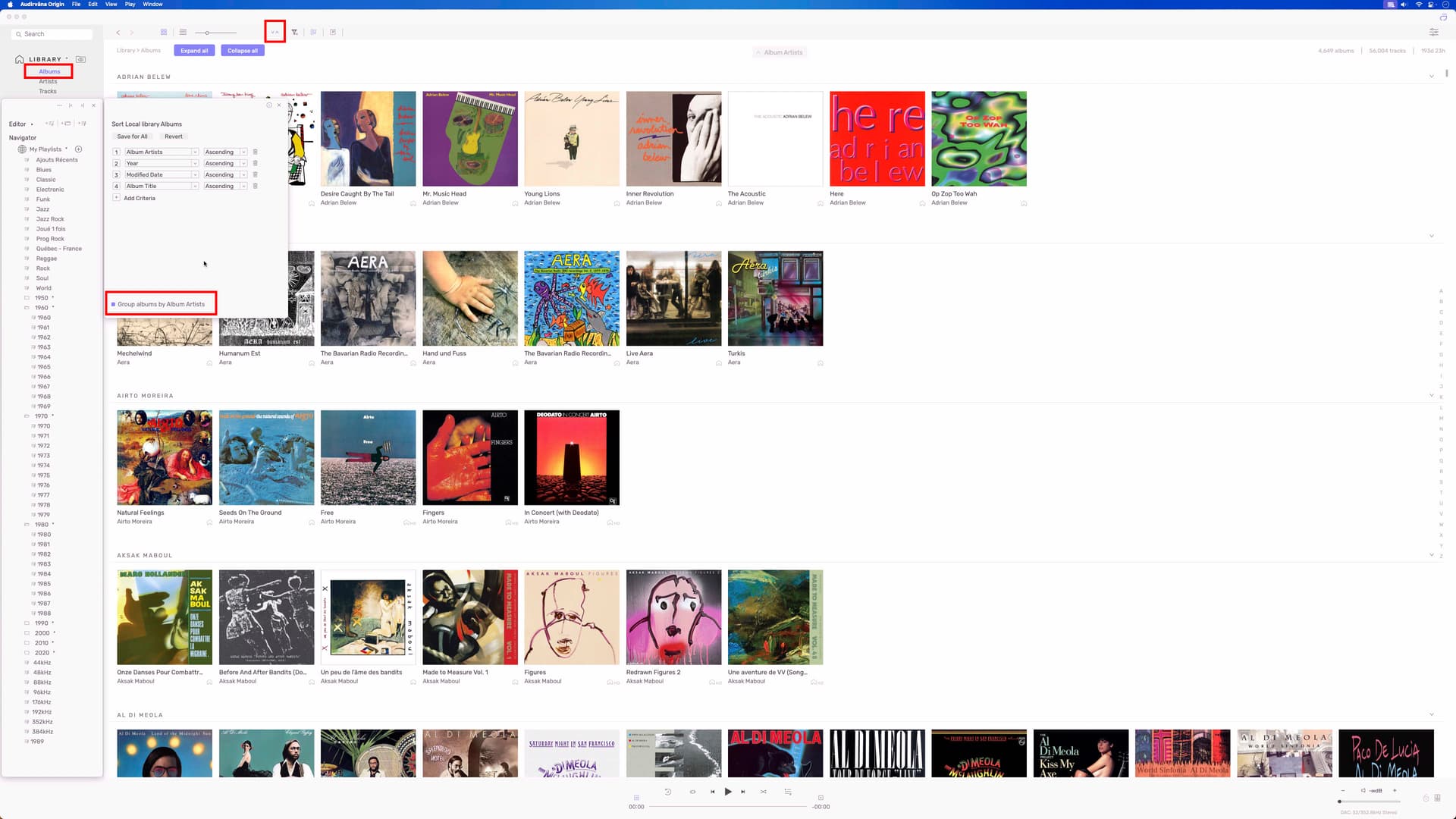
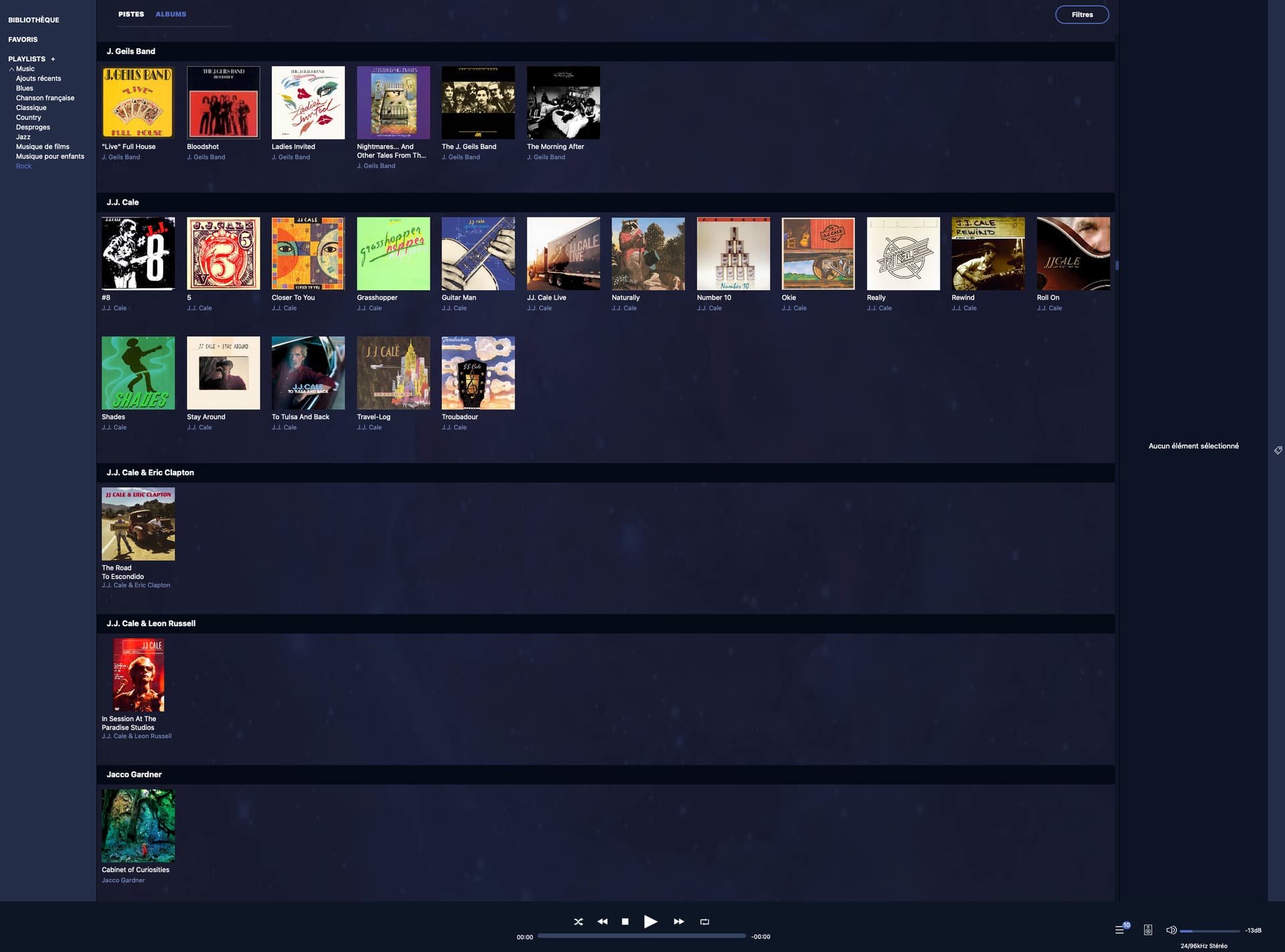
De retour après un peu plus d’un an, je teste la dernière version d’Origin et j’apprécie de pouvoir enfin classer ma liste de musique classique différemment des autres. En revanche, je regrette beaucoup le changement de présentation, je ne me souviens plus s’il était déjà présent la dernière fois, car il rend les listes beaucoup moins lisibles que dans la vieille version 3.5.5. Comme une image vaut mieux qu’un long discours, j’illustre mon propos avec deux captures d’écran. Peut-être qu’il est possible de revenir à l’ancienne présentation, mais je n’ai pas trouvé comment. Ce serait vraiment bien de pouvoir choisir entre l’ancienne et la nouvelle ! L’ergonomie compte aussi ![]()
Merci et bonne continuation !
Origin :
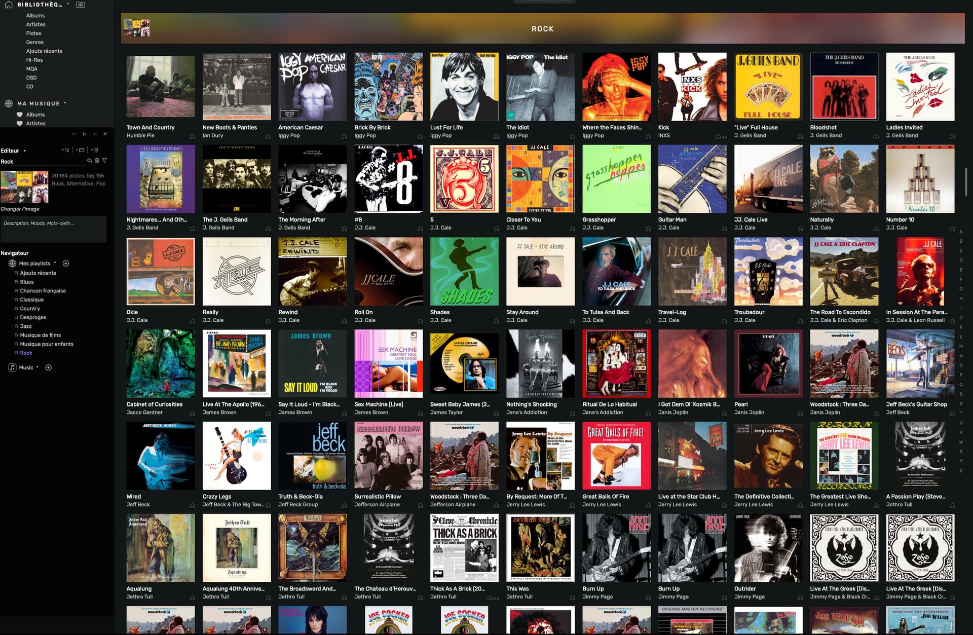
v.3.5.5 :
(Hi,
Back after a little over a year, I’m testing the latest version of Origin and I appreciate finally being able to organize my classical music list differently from the others. However, I really regret the change in layout. I can’t remember if it was already there last time, because it makes the lists much less readable than in the old version 3.5.5. Since a picture is worth a thousand words, I’m illustrating my point with two screenshots. Perhaps it’s possible to revert to the old layout, but I haven’t figured out how. It would be really nice to be able to choose between the old and new layouts! Usability matters too ![]()
Thank you and keep up the good work!)