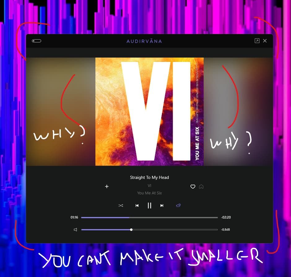
I completely agree. As it is now, there’s a lot of wasted space. Really weird UI decision there. The mini-player in Audirvana Classic was much better and more compact. Three steps forward, one step back.
I did a user voice addressing the exact same thing a while back. Let’s hope @Antoine and the devs listen. Even iTunes and Apple Music get their mini-players right.
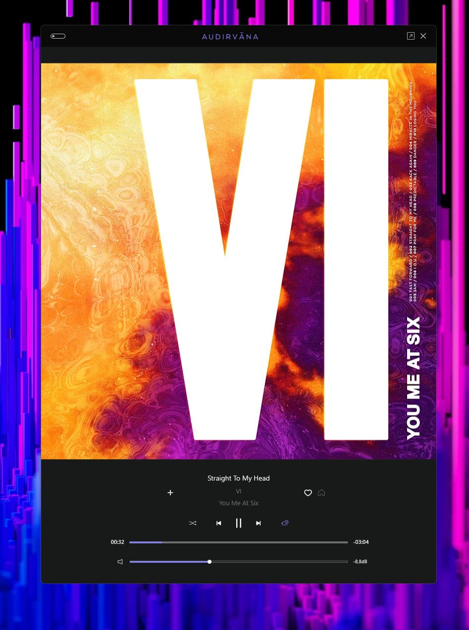
I don’t understand why artist, composer, band are not active links like elsewhere.
would be nice to have the waveform display option here also.
A heading would be nice showing the origin of the current file playing.
indication of the file quality also would be nice.
There is enough room for all the above & more!
Is there a keyboard short cut to open & close mini player?