I’m fairly new to Audirvaña, but already have some thougts about it. Of course I haven’t browsed this section to look for similar entries, so be easy with me. Also, English is not my first language and I might not hit the right tone writing about those things. This is not ment to be harsh, or unfriendly. It’s just a list of things I would do different, if I would be in charge
Who knows, maybe there’s something in the list that the devolepers can pick up for a next - hopefully free of charge - release.
Overall I like Audirvaña and am quite pleased with the program. At the moment it is my first choice of playing music and I’m sure there is more to discover. It works flawless with my set-up, doesn’t use much disk space and thankfully acts restrained.
I’m on a Mac laptop and things maybe look or act different on other machines.
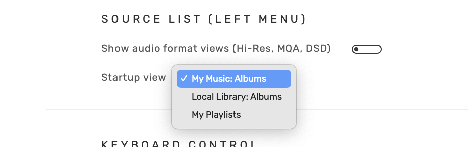
When opening, Audirvaña starts at the “ Album” playlist. I don’t use this and it could be great if Audirvaña could start with what was selected last (playlist, artist, album,…)
I guess those -items are more or less simple playlists, one could add herself/himself. I don’t use any of them and it would be great to be able to remove them, or treat them as normal playlist, so one could delete them.
Speaking of playlists: I find adding and managing playlists very cumbersome and not intuitive at all. I still can’t add one without a hassle. It would be great to see a change here. For example: A right click on an existing smart playlist could bring up a menu with the ability to change the settings. This too should be in the options one can open hitting the … menu within the playlist window.
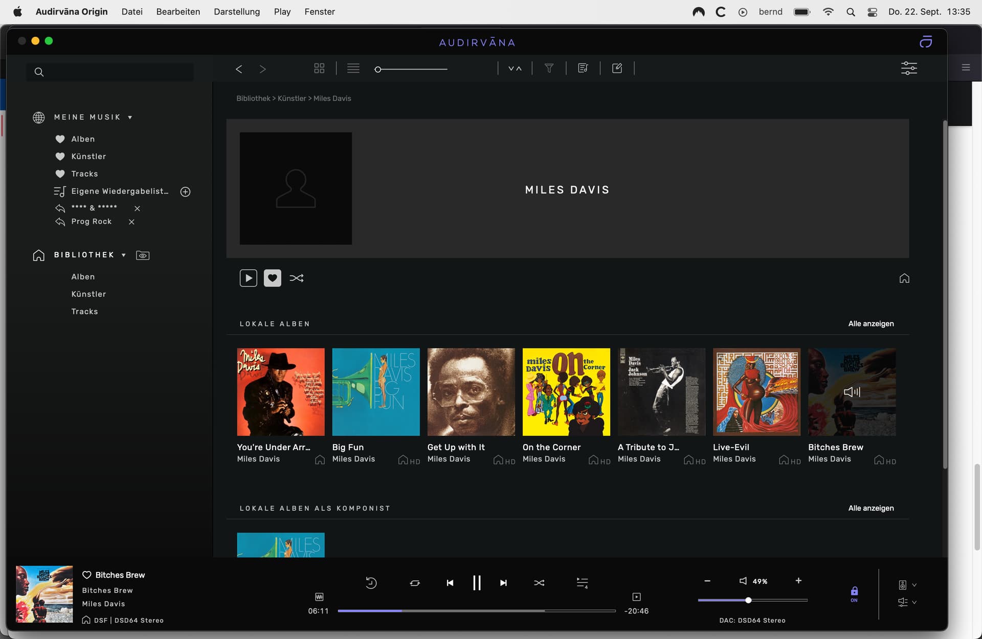
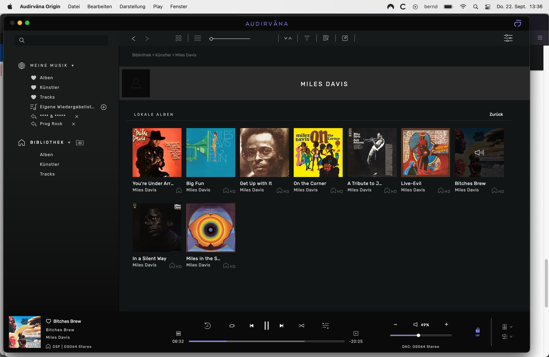
The main window showing content of playlists, albums, artists, etc. brings up a window-part on top with some information about the playlist, albums, artists, etc. and a picture. It gets smaller when scrolling down the list. I find this part not necessary nor usefull, especially when it is as huge as it is at the beginning and would prefer just a simple and small information part on top, so the focus stays on the music list. Propably the play and shuffle play button for playlists could be part of this part as they vanish when scrolling down a playlist.
It would be nice to have different colors for songs that play and songs that are just activated by clicking on them with the mouse.
I love playing all albums from an artist in a row, starting with the first (= oldest) album to the last (= newest). Unfortunatelly there is no sorting option at all within the albums section of an artist, at least not in the nicer cover view option. One has to switch to the folder view to have the albums sorted last album to newest album. It seems that the sorting option is activated in every other view and list.
Another bigger issue to me is hopping to a desired artist, album or track within every of the views, except the folder view: I’d love to be able to jump down the list by typing in a letter on the keyboard, propably followed by a finer adjustment with the next typed in letter. An alternative could be an alphabet to tab on, but the letter typing solution would be my first choice. But just scrolling is very cumbersome.
Because of my last two “thoughts” I haven’t deleted my other playing app yet and because of them I would rate Audirvaña with three out of five stars.
This one is a good point. In the meantime I got used to search “Google style”, that I don’t miss this feature so much. It would make sense to have it though.
Alphabet tab that shows as soon as you start scrolling, but also the ability to type the letters directly, would be the ideal solution.
Funnily enough, while beta testing 2.0 I asked the same thing again (I asked it already when AS was first released). But it’s not planned, although as usual, if enough users ask for it, then it will be considered (and I hope so, that’s the kind of useless clutter for me).
It’s propably not a big deal, but at first I was confused not seeing all the albums and thought they were missing. I wasn’t expecting to not see all albums from an artist when entering the artist section. And I can’t think of another reason for a reduced list than for design reason.
For the random play: I am used to have this option only for the current playing event, like the one album I am listening to or the one playlist. So it confused me, when I was playing an album and the songs were played in the “wrong” order. Of course that’s something one can get used to, but it propably is something to consider for an update. Nothing serious though.

 Album” playlist. I don’t use this and it could be great if Audirvaña could start with what was selected last (playlist, artist, album,…)