I’m sorry, but I think the new design is fugly.
It looks cluttered and confusing compared to the old one.
The preference pane is a mess.
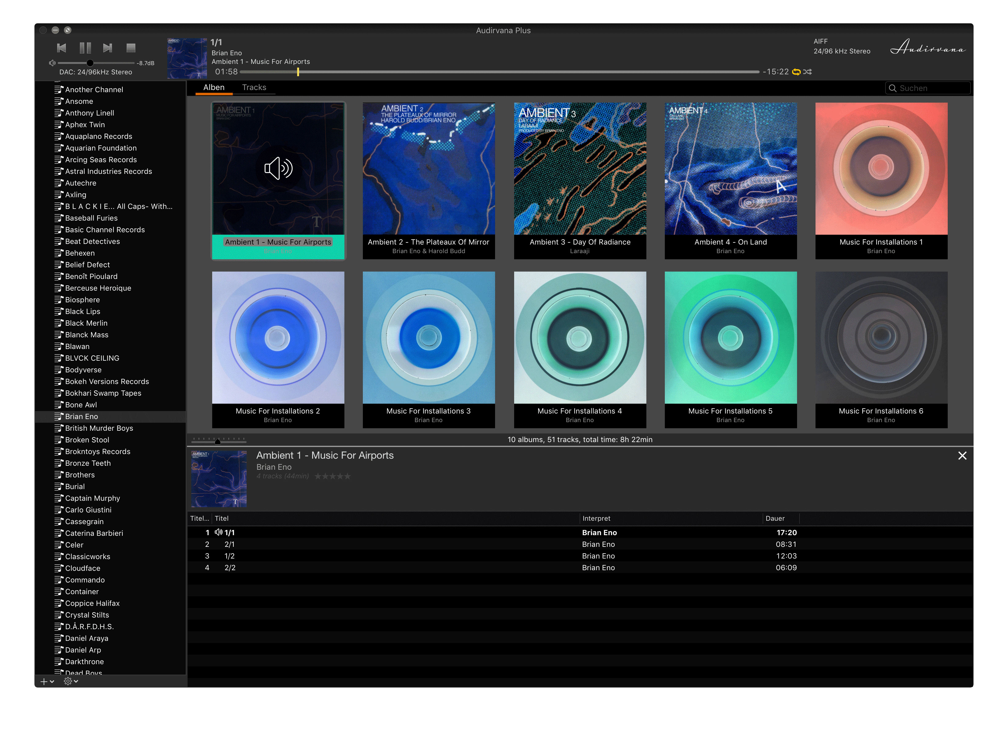
When I click on a playlist of an artist I don’t need a useless summary of their albums taking up space.
And what’s up with that blue? Looks out of place on Mojave dark mode.
IMHO should’ve just made the old design flat and with dark mode colours.
To summarize: Getting rid of that album summary header and using the original dark mode colours would help a lot.
Agree almost entirely. Why waste the top screen space with a composite header image of covers. The album thumbnails now seem fixed in size so I can’t see as many albums as before. The Blue is not nice. What has happened to the Track Detail pane? I do all my secondary tag editing (i.e. picking up the mistakes I made first time round in Metadatics!) using the General and extended tag fields which seem to have gone. For this reason alone I wouldn’t upgrade to 3.5.
One bug noted is the scrolling track field in the player pane has the black type word ‘Label’ displayed at all times behind the scrolling white title text.
I really like the blue dark interface. However, I do miss the option to display the album covers larger. It would be nice to be able to view the album cover full screen. Another option that would be nice is to be able to quickly click on a link to a website like Wikipedia to read details of the album.
And where is the equalizer?
This looks nice but my critique is that there are not enough options.
I know it’s superficial, but all I was looking forward to was a dark mode design so Audirvana will look integrated within the OS.
Because sound-wise Audirvana is still the best, I am sad that it seems to go down the drain design-wise.
I just cannot fathom a professional software developer thinking “Yep, that looks awesome.”
It looks like a cheap website integrated player. I hope he hasn’t paid a professional designer for that.
Oversized fonts not lining up, that blue, that galaxy pic in the background, wasting space for non-information (that album summary…)? Come on!
Why is the recent playlist button on the bottom and the back/forward arrows on top?
The old design was completely functional, why switch things around for the sake of it?
Reminds me of what Microsoft has done with Skype.
Rant over.
P.S. You can resize the displayed albums with trackpad gestures.
What has happened to the Track Detail pane? I do all my secondary tag editing (i.e. picking up the mistakes I made first time round in Metadatics!) using the General and extended tag fields which seem to have gone.
[/quote]
So you found it… tag icon on the right side of the window. click an album and see its tagsclick a song or all of album to see their tags…
When an album is playing you see it on the bottom of the window… cover, title, name…
simply click the cover for the mini player to appear, then you can stretch it to the maximum high of your screen
and it will remains like it… close it but the button on the right up not the red button it will close A+
I have to say, this is basically what I was hoping for as well. I really LOVED the functional layout and use of the older version. Just wanted it in black.
The new format is growing on me. My only real “complaint” is that I wish all the font sizes were much smaller so you could see a lot more info with the given real estate.
There are a few other UI things I mentioned to Damien in the beta testing stage, none of which are deal breakers.
We will see where A+ goes from here.
Sorry Audirvana, but this is fundamentally inefficient design. The basics of usability are turned on their heads. This idea to moving beck and fort like in browser, hence flying all over the screen with mouse; unclear module segmentation, still lacking ability to jump alphabetically in a large amount of content, … those a re just basics of managing data and understanding your user behavior. For heaven sake, how do you approach your physical (CD, LP) library? Scan endlessly always from the beginning, or you go for a first letter group… and this is software you can get me there just by typing first few letter, which accidentally the same process is what you have in macOS… which gets us to the point where software(Audirvana) is decreasing the very foundations on which it is built. I can get to my album faster in Finder…
Why in the name of the Bach is there icons on all sides? Why is minimal player, that much minimal that can easily have option for cover art or song list?
It is really disappointing to call this upgrade and if you feel that this is designed, you are horribly mistaken, this has nothing to do with the design, with how it works.
For me too, 3.5 forces me to big mouse movements and mouse wheel actions. I miss very much first letter typing action in lists. And in search results (track view) sorting is essential.
Sorry to say, but this new layout might be a deal breaker for me. Such a waste of space, very inefficient design.
I often browse by genre, e.g. jazz, and scroll through the playlist in track view. Now I see just 14 tracks at once! I hope we will be able to make the view MUCH more compact in an upcoming version.
Why are we forced to have a big empty column on the left of the track view?
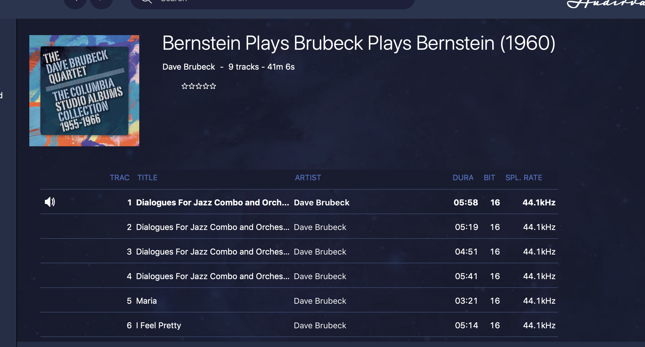
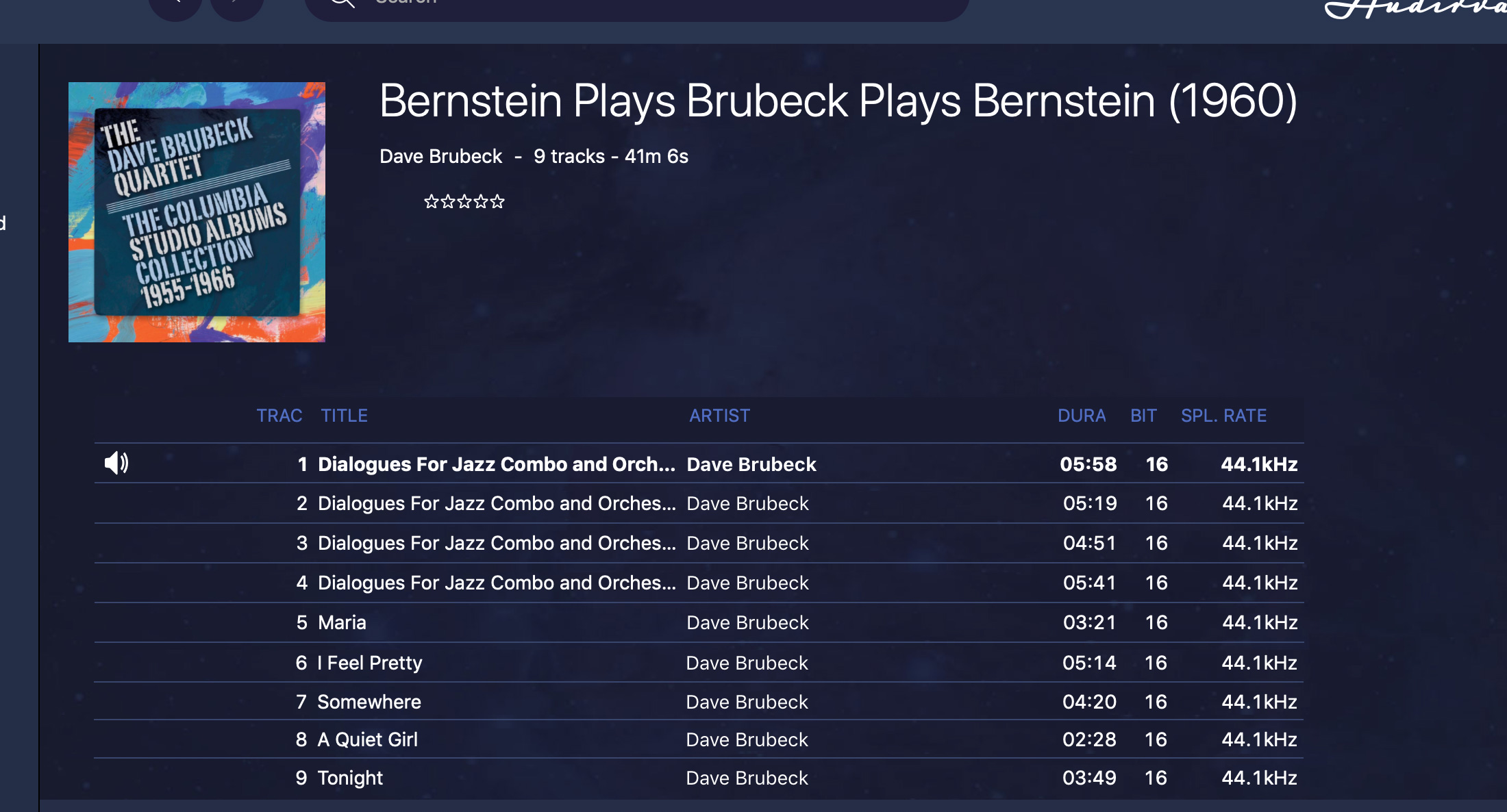
Search results are even worse. For example, I have 21 Brubeck albums, but only 3 are listed in the standard search view. Yes, I can click on ‘see all’ to see all the album covers but it’s an unnecessary step to take every time. Seeing just 3 results for each attribute type is basically useless (except perhaps for the artist column). Why isn’t there a list view option?
The settings view is so big and clunky - it reminds me of the Skype disaster, as someone already pointed out. Now the settings are spread over 6 screen heights, whereas 1-2 would be possible and much more convenient. Why make us scroll so much to get to what we need?
Some column headers are completely out of line with the rest of the column. See the Track# and Disc# columns. What a mess!
The info window is way to big and clunky, much like the settings view.
And slightly off topic, but it appears there is still no support for the volume control on Macs with Touch Bars
However, I did find one positive thing: I do like the overall color and look of the dark mode.
Agree with all of the above comments. I’m finding the new design very difficult to navigate and at seems like it was designed (poorly) for the masses rather than folks who are serious about their music. It also seems that bugs are increasing instead of decreasing, which is worrisome.
I updated to this yesterday.
Despite trying (& wanting) to like it - I just cant - I really dislike it to the point ive had to go back to using 3.2.
I really like that we now have a mini player - but I’m afraid thats where the good thigns stop.
You cant resize the mian window properly - The minimum width it can go down to is about 3/4 of the width my screen - its too wide.
The spacing of elements in the UI is all over the show - I’m not a pedant, but icons and text simply dont line up and it looks shoddy (like the fact the track list looks like it slightly covers slightly covers the “clear” button").
Huge fonts mean you can’t see enough information on the screen and there no option to resize.
Column text is misaligned to headings.
Theres a huge amount of sapce to the left of your current playlist where popup play and like buttons appear - this is just wasted space for 99% of the time - implement this stuff in a contenxt menu.
Standard UX based hints that exists in every app are missing - like column delimiters that show you can resize a column.
Menu options and settings are hidden behind collapsing lists menaing its really difficult to get a full view of what I can change - and when I expand all the menus the enormous fonts mean i have to scroll for miles to read things.
Whay are the DAC setting not with the rest of the settings? Its unintuative.
Dark mode on mac isnt actually dark mode when you compare it to the rest of the OS - I dont get why whn this is baked into the OS.
We’ve gone from a sparse but functional and efficient UI to one that is convoluted, confusing and out of place in the OS.
I love this player - its sound quality is superb and its without questions the best sounding player I’ve used on mac - but please for the love of god change the UI back and implement dark mode properly.
Just starting out with Audirvana and agree - excellent sound quality (albeit with occasional dropouts). But I don’t like the interface much. Firstly there is so much wasted space - for example a tiny album cover and text column on the left that never takes more than one third of the screen width. Can we please have user selectable image and font sizes ? I appreciate some on this forum want some things more compact, but please spare a thought for those of us not blessed with the eyesight of a 9 year old. When viewing a playlist I see 9 such cover images on the screen,- I would love the option to go larger even if it meant seeimng just 6 or so - I don’t mind a bit of scrolling.
Secondly it does not seem very responsive - the remote is slow to load and connect to start with and often I find I have to select a track twice to play it. And what is the point on re-displaying the track playing at the foot of the screen ? Just stick a symbol on the selected track in the list.
My other server software (LMS with Squeezepad as a controller) was is so much clearer and more user friendly/
Now - off to Qobuz to see if I can organise playlists - all I am seeing at the moment is an ever growing column of non-indexed playlsts. Is it possible to create sub-folders ? That way I could set a few up for classical, jazz, electro etc and drop appropriate playlists into those buckets.