The new remote generally looks good and the ability to select the output from the remote is a big plus.
The only major problem I have is with the display by Artists. It’s fine in portrait mode, but in landscape it’s badly messed up, with multiple missing, duplicated and empty items. Id be interested if other people are seeing this, or whether it’s specific to my configuration.
First, Yes, there are many new features that I like, thanks for that!
Second. But… there is always that but. Portrait mode looks like all the Android-apps around 2011. So much wasted space, beautiful album art reduced to almost nothing (why, why, why?). Artist/album - same thing, just sad looking thing from the past with landscape too. And yes, landscape is a mess for me too, album art landing where ever. And it takes forever for my collection (4000 albums) to show properly every time I open the app.
I hope these things get fixed soon! And yes, I’m still a big fan of Audirvana, just shocked that is all (especially as album art lover)
Same here… (In a sad/mean way l was hoping l wasn’t alone as then l knew l would have a lot of homework in front of me).In my Artist collection I only get to the end of the ‘A’ list, after scrolling through a endless list of ‘Artists Name’ and then it stops!
2018 iPad Pro with IOS 13.1.3 firmware
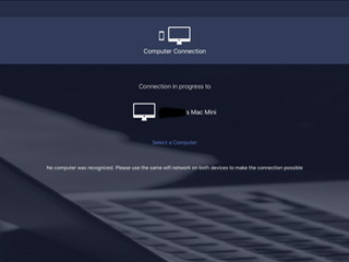
Same problem when the app works. Usually it doesn’t work without a usb cable and the app will not appear in iPad’s settings. Everything connected to the same network but the app will not connect to my Mac mini. Very disappointed. All I get is as per the attached photo
I gave up. Deleted and refund issued from iTunes. I am sure it’s the app because it’s the only app not appearing in the iPad’s settings. Same story with iPhone. Spotify connect works fine so it’s not a firewall issue.
One comment about the portrait mode. I actually find it useful for displaying full (long) album titles. In landscape mode I sometimes can’t tell which album version is which. A quick flick to portrait clarifies. I think the option of both is good. Maybe have it as a user selectable option?
My initial views on the new remote is it’s a great improvement.
 Same problem when the app works. Usually it doesn’t work without a usb cable and the app will not appear in iPad’s settings. Everything connected to the same network but the app will not connect to my Mac mini. Very disappointed. All I get is as per the attached photo
