Hello,
Since Origin is only playing our files, maybe @Damien could update the layout of Origin…
easy updating ![]()
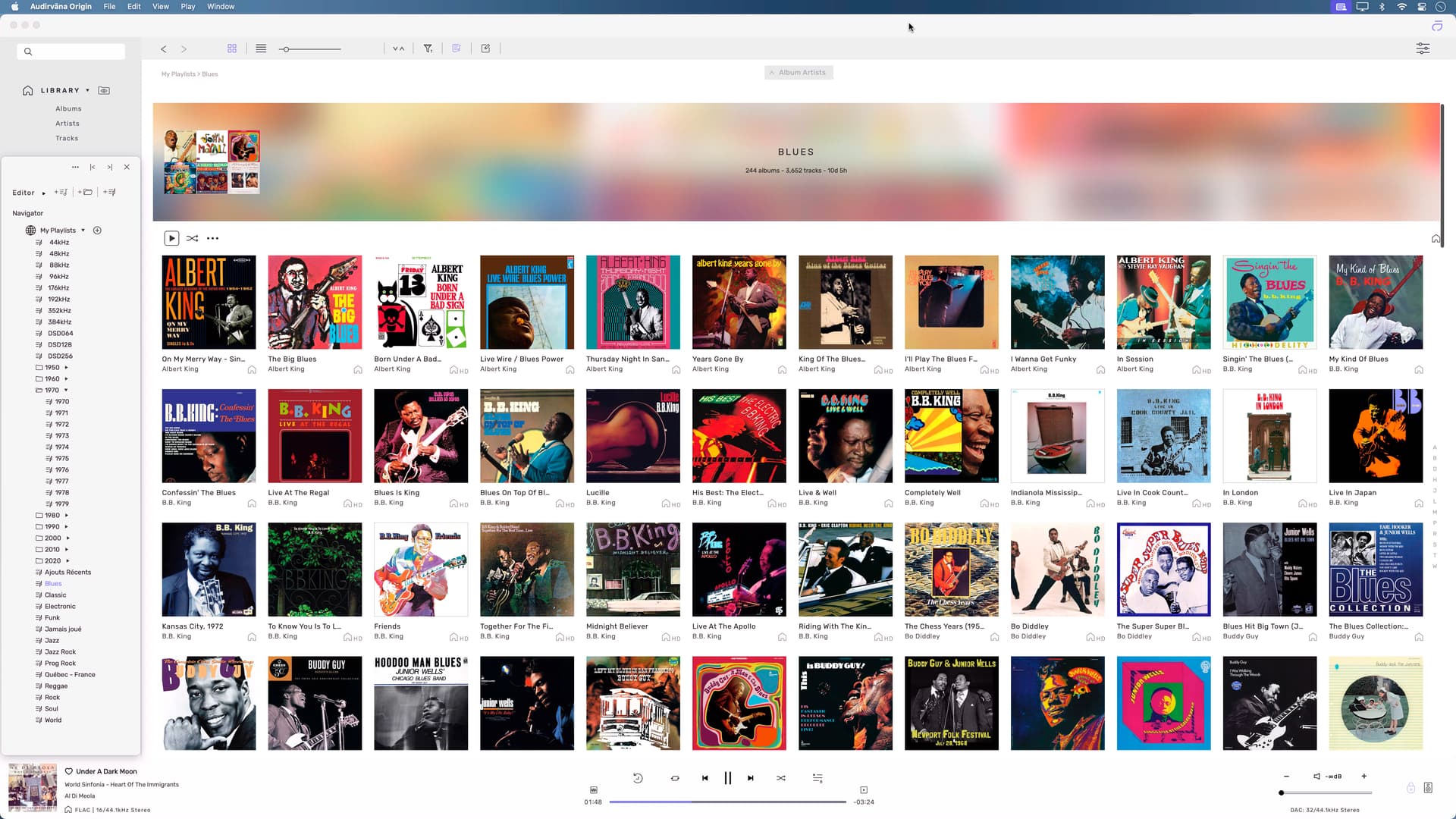
1 - Removing the big bar in our playlists to give us another full row of album view,
maybe i miss something, but that bar as no purpose in Origin…
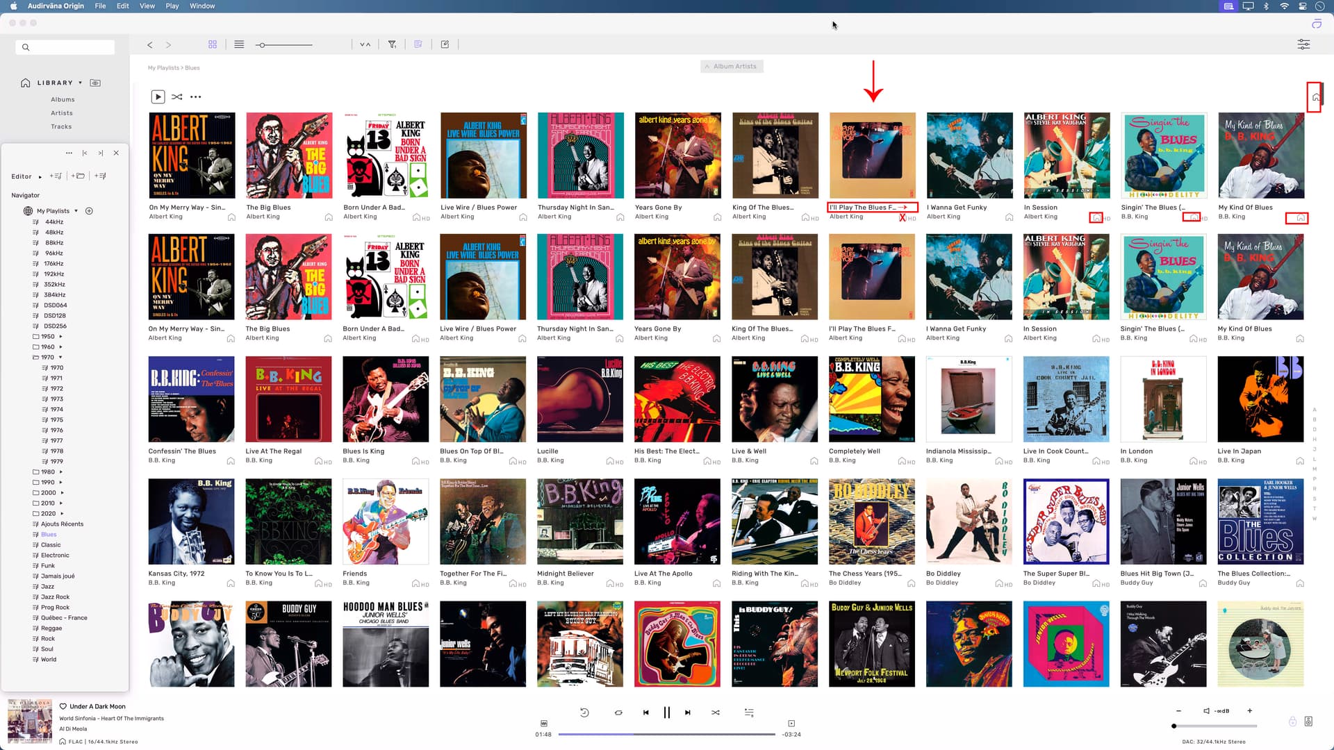
2 - Since we only play local files, removing the home icon (house)
on the second row of each album…
3 - Removing that icon that is higher than the HD symbol on the same line
(this one can stay, but not necessary for me).
I think this could be very useful to allow the album name to go the full length
to the right, even for a long Artist name also.
4 - Not willing to remove all that, Ok.
I think that it is just the House symbol that it is a tiny little bit to high
as it block the first line (album name) to go fully to the right and not being dotted…