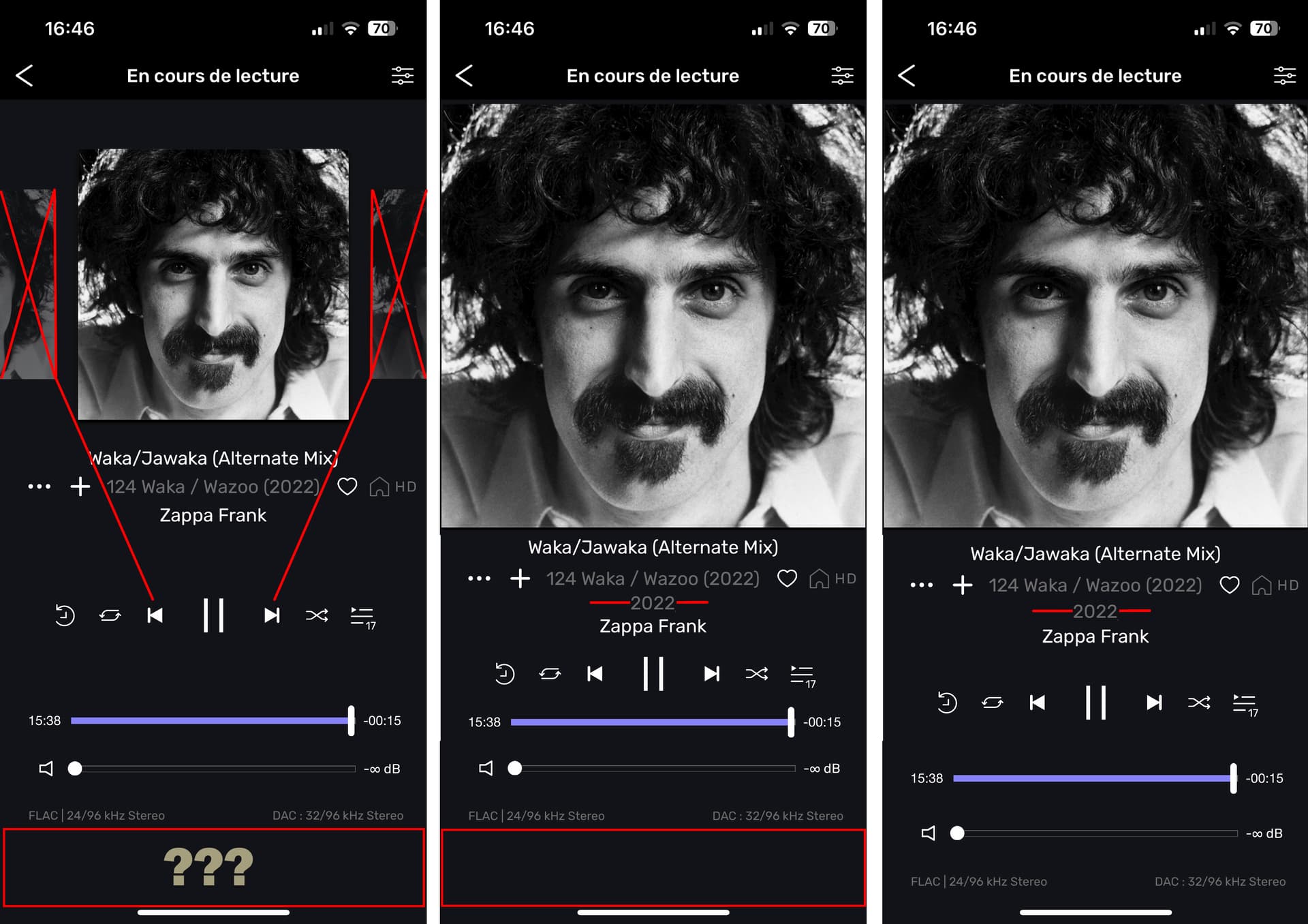
Hello, why so much wasted space on the remote??
i know you put your big purple rectangle at the bottom to tell us how to stop or release the DAC,
but since we don’t use the controls when pause, put the rectangle there?
The two flips left and right (before and after) are not useful when there is already those 2 buttons that do already that… it is not like reading a book when you flip pages… you just flip to next song or back to previous song with the same cover picture…
The full picture of the album is so simple to show on the main window without reducing any typo or your layout… your new way to show it is so not friendly… three dots, show album, click album cover, back back back…
When reducing just a bit the space between everything under the picture, you could fit the album year also, That is useful… without reducing the place for your big purple rectangle to release… if you have to let it there… and if not everything is less cluttered