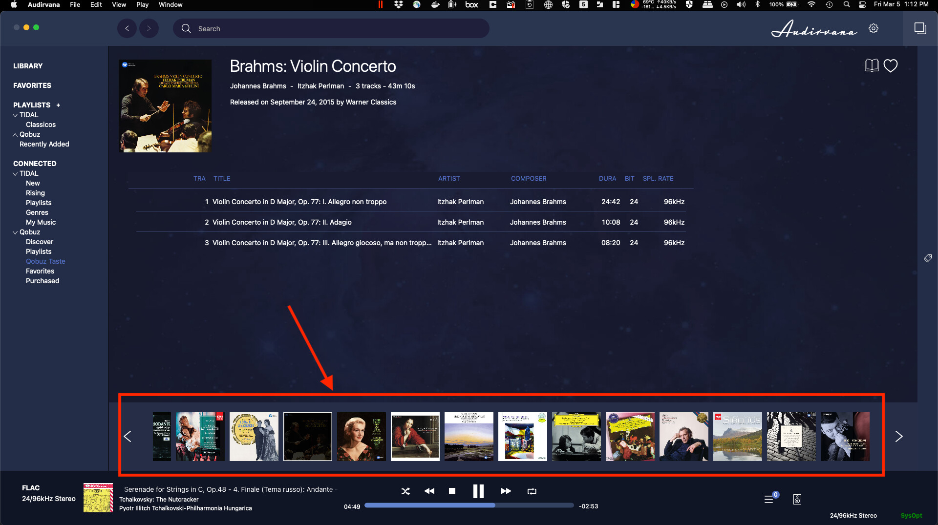
Hi Audirvana fellows, I’d like to suggest a change to the Audirvana interface. The list of albums on the bottom of the page is tiny, and we can’t read the album’s titles. Could you please make the window there resizable to change the size and make it a little bigger? I’m attaching an image so you can see what I’m talking about. Thanks a lot.
Many people would like it to disappear not become bigger 
1 Like
Not me, in particular when in Qobuz an album sometimes is only a single track. Then it is nice to have a look at other albums!
That’s why I suggested a resizable window. It means you can set the size you want, even a zero size 
1 Like
I didn’t even realise that there was an album strip!
But I never even look at the main Audirvana screen on my computer. I do everything via the remote app.
Me, i don’t really care for that strip too, i use the remote mostly or for tagging my database, or ajusting things, i use the Mac screen sharing from a 5k 27in iMac, so enough place to lose 
For me also this bar is difficult to use. As you can see on rocamargo’s screenshot the current album is not displayed and you have to scroll to the right to find it (it’s a common issue).
This topic was automatically closed 375 days after the last reply. New replies are no longer allowed.