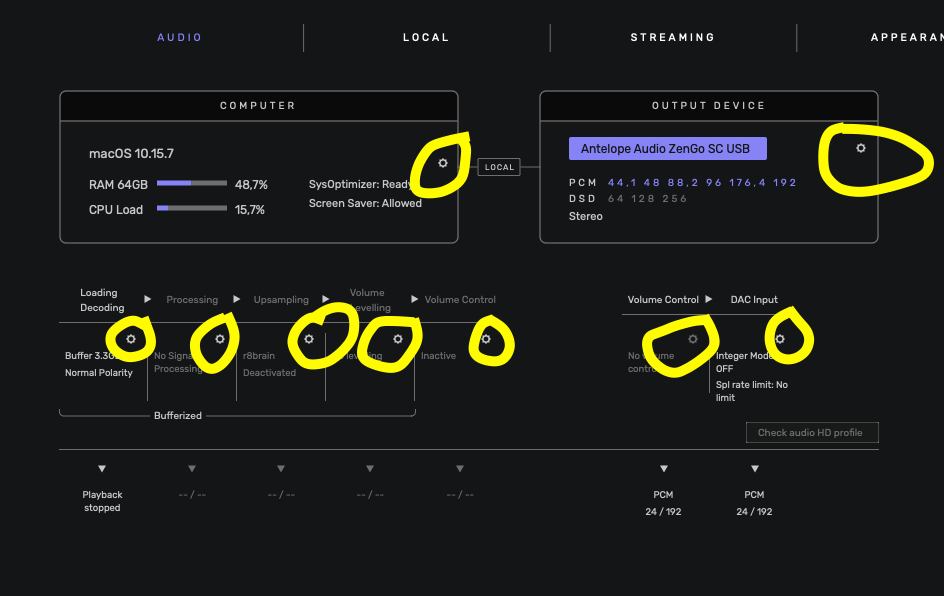
usinf the same “wheel” settings icon the reach separate settings I a big UI nogo. As a user it takes you forever to understand that “hey, this isn’t the same settings panel, that this wheel is opening.” I spent forever looking for stuff. It’s way too small aswell. Make a “edit” button there or something. A lot of stuff (on/off buttons etc) are a bit small aswell. But look great.
This topic was automatically closed 375 days after the last reply. New replies are no longer allowed.