I created a logical naming convention for the Sort Album metadata. I add a number in front of the name. So for the first album by an artists, I add "101 - " in front of the album name. Then the next album is tagged "102 - " in front of the album name, etc. So as long as the playback software uses the Sort Album metadata, it will show the albums in the order I want, which in my case is chronological.
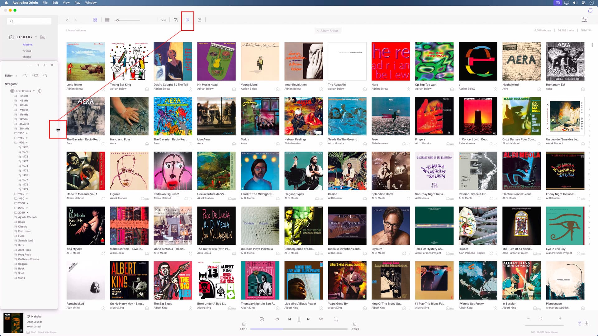
Library → Albums
If you choose sort by Album Artist then the sort order uses the Sort Album metadata.
Library → Artists
When you click on an Artist, under Local Albums it shows their Albums sorted by date with newest first and oldest last. This display order continues if you click on See All.
Why is Artists only sorting by date when Albums has a sort option? When drilling down on an artist it should either sort by Album Artist using the Sort Album metadata or offer the ability to change the sort order.
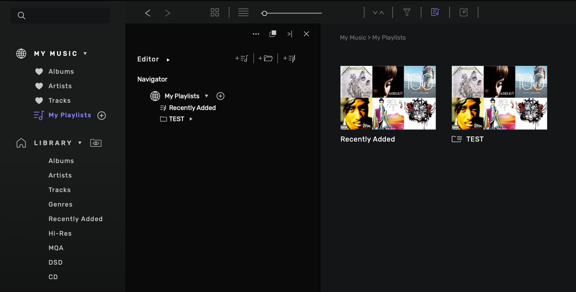
Playlists
Why are Playlists under My Music and not Library? Playlists in Origin are specific to your local Library and should be a member of Library.
When you do File → Import Playlist, the imported playlist is only seen when clicking on My Playlists. This is the opposite of what happens when you do File → New Playlist or File → New Smart Playlist. Either of those choices places the playlist under My Playlists.
Why can’t you save a Play Queue to a Playlist?
My Music
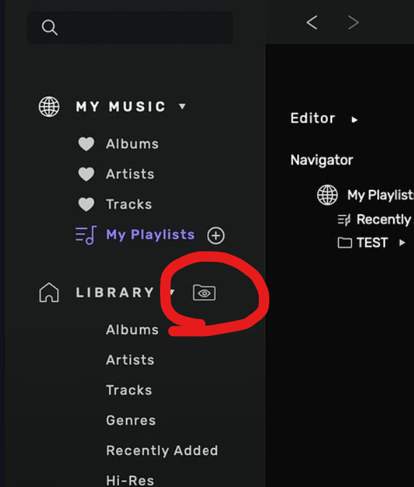
If you choose not to “love” albums, artists and tracks you can hide it by collapsing it, but then you can’t get to your playlists. This is another good reason to move playlists to Library
thank you for your post, by design, we chose to only sort by date when you are on the page of an artist. You can’t sort this view but you are not the first one asking for it and we are constantly doing some change in the app like this. We may do it in the future.
It’s also by design, playlists are local only with Audirvāna Origin but given you can have a lot of playlists as we saw from older versions of Audirvāna, we had to make a choice. That’s why there is a playlists manager in the app, where you found “File → Import Playlist”.
Thank you for reporting it, we will change this in a future update.
You can do this, select all the play queue (CMD+A on MacOs or CTRL+A on Windows) and click on the three dot icon of a track, you will see the option to add the play queue to a playlist
Since Playlists are Local, then it should it be under Library in Origin. It makes more sense to be there since they are part of your Library. Once it’s under Library Playlists can be an expandable item just like Library. That way of there are too many and messy you can collapse it.
Why can’t Library look and work like a hierarchical explorer? I would bet 99% or more of your users understand and feel comfortable with that interface.
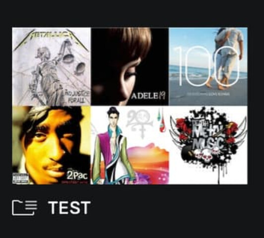
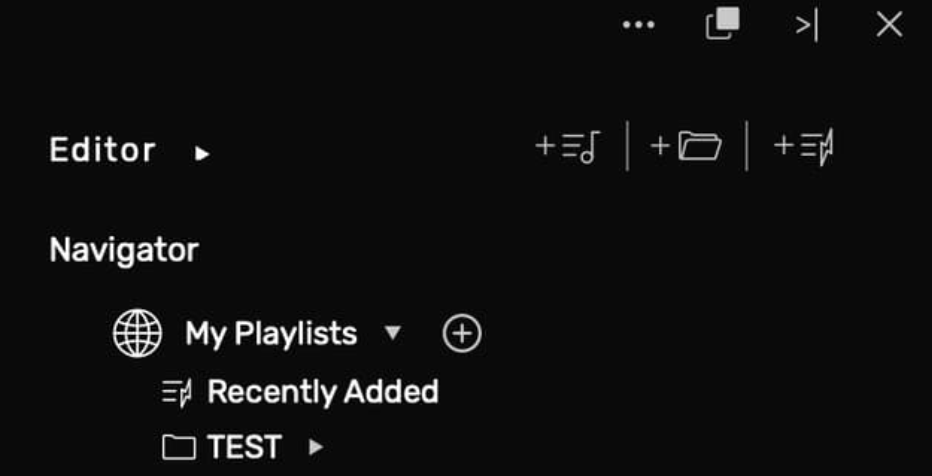
What is the difference between a Folder and a Playlist in My Playlists? Doesn’t a folder contain multiple Playlists for organization? Then why doesn’t Playlist Folders show under My Playlists?
If you move Playlists to Library where it makes more sense you can either display all Playlists and Folders which could be messy if you have a lot or make Playlistsand Folders an expandable option like Library and My Music is.
My Music makes sense for Studio where you are using multiple streaming sources and want to bookmark (AKA “Love”) albums, artists and tracks to get back to them quickly. I find it useless in Origin and would prefer to not see it at all.
Yes, like List view in macOS Finder or Windows File Explorer. With that user experience, anything in Library can be seen without having to click on the item to see it’s contents. If there are multiple sub items, you click to expand the list.
Folder View under Library is nice but it wasn’t obvious that it was a clickable item. This is nice as long as your Library files are organized.
Right now the left pane with my Music and Library is not very functional and wastes space. A better UI experience would be to make them tabs at the top of the screen like this:
Library - My Albums - My Artists - My Tracks
The tabs could then be dragged and dropped into any order.
Why do you need to open My Playlists to see the folders? You show created playlists under My Playlists. So why aren’t you showing the folders? Also, I couldn’t drag a playlist I imported or created into a folder making Folders useless.
Why when you click an Artist under Library → Artists you can only see their albums and not their contents? It would be nice if you could see the albums and their contents at the same time. I know you can click on an Album see it’s content and go back and click another. But it’s more efficient to show all albums and tracks on the same view.
FYI, I’ve done a lot of work on usability and efficiency so I always look for the most efficient way to use software.
Thanks @lookout57
Many users suggested already to integrate the playlists into the sidebar.
Being able to see the content of all albums by clicking on an artist would make Audirvana more intuitive, as well as it should be possible to see all albums in album view and at the same time beeing able to see the tracks of an album you clicked on.
I get your comments on the UX of the software but keep in mind that we are not only developing Audirvāna Origin, we are also developing Audirvāna Studio and this, we need to minimize the difference between the software to avoir a development nightmare.
I understand you are trying to minimize the coding differences between the applications. But you are trying to make one UX work for two very different applications with different needs.
Isn’t all of the backend code identical between the applications and modularized? My background is writing backend / command line based software. When I worked with UX developers they were able to swap UX code out easily without changing my backend code.
I get it, take what you have developed, make some tweaks to make it different and add a new revenue stream for people like me who don’t stream or want to pay for subscriptions. But by prioritizing Studio and it’s UX, you’ve crippled Origin. In a lot of ways the UX in Audirvana 3.5 is better than Origin for local only music.
I wish it was that easy. Audirvāna is not a javascript app you can change every part of the UX instantaneously. On top of that, we need to deal with differences between coding with Visual Studio and Xcode which both of them have their pros and cons (given that Visual Studio is far easier to deal with the UX on it since we see the change in real time while coding )
Mark my word, I never said we wont do any change on the UX of Audirvāna Origin but if there is a lot of people asking for doing changes like you suggest, we will consider going forward and maybe change the UX of Audirvāna Origin
Are you importing a manual or smart playlist? If it’s a manual playlist, do you have the option “Sort also Manual playlists” activated on the sorting options of Audirvāna?
I think part of the issue was I upgraded from Audirvana to Audirvana Plus to Audirvana Origin and had 3 different preferences files (macOS), one for each version. I ended up deleting Origin, Audirvana Application Support and the 3 preference files and reinstalling.
The good news is now on the imported manual playlist there is no sort option, However there is no option to sort manual playlists in Preferences which I’m fine with.
Audirvana UI/UX logic is behind human comprehension, it brokes so much UI/UX patterns people are used to that it does not improve the experience at all and cause lot of frustration.
Just afew for example:
The back/forward arrows are an unnecessary complexity to move between settings and library, just use icons, they are by far quicker and more clear to understand.
Left bar has “My Playlists” topic but show no playlist at all, a tree view would make them accessible with a single click and very clear since you would see all of them (scrolling if many), no, you have to dig by clicking the “My Playlists” and then navigate them…
Once you’re in the playlists view if you click one, you enter it, if you want to return to the list you have to use the “back” button, a horizontally scrollable list on top with selectable playlist image/icon to populate a frame below to show the contained albums/tracks would be by far preferable, so you can just click once and navigate the playlist content without having to press the “back” button so many times
Creating smart playlist is a pain, you have to press the + icon then press the playlist type you want to create, again multiple clicks, the most pain here is the browser make the view below change while overlaying on it, so you press something in a pop-up window but it cause another window content to be changed…
There are many others, I really appreciate the app from a music reproduction standpoint but so sad with the UI/UX