Hello team, as i show to the photo there some misalignments on UI and some might be improved.
If its possible may you consider to take a look at them please to be more eye catchy and ease of use?
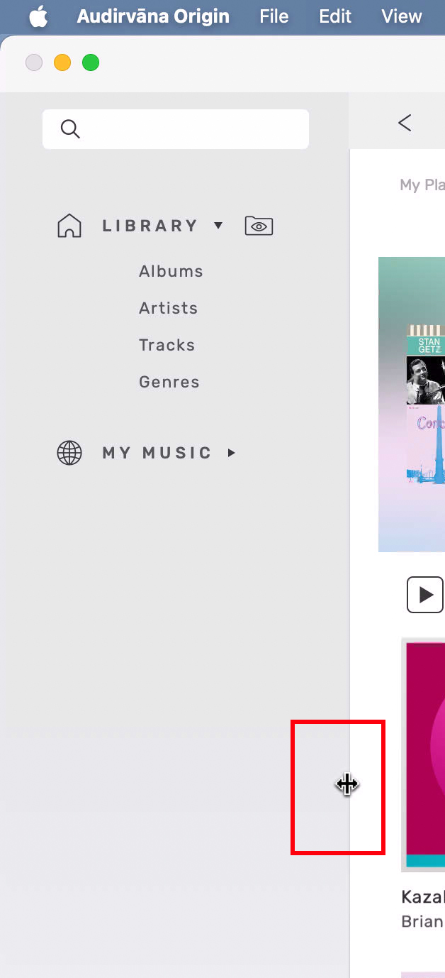
for example the hide of side bar gives more space to the main view!
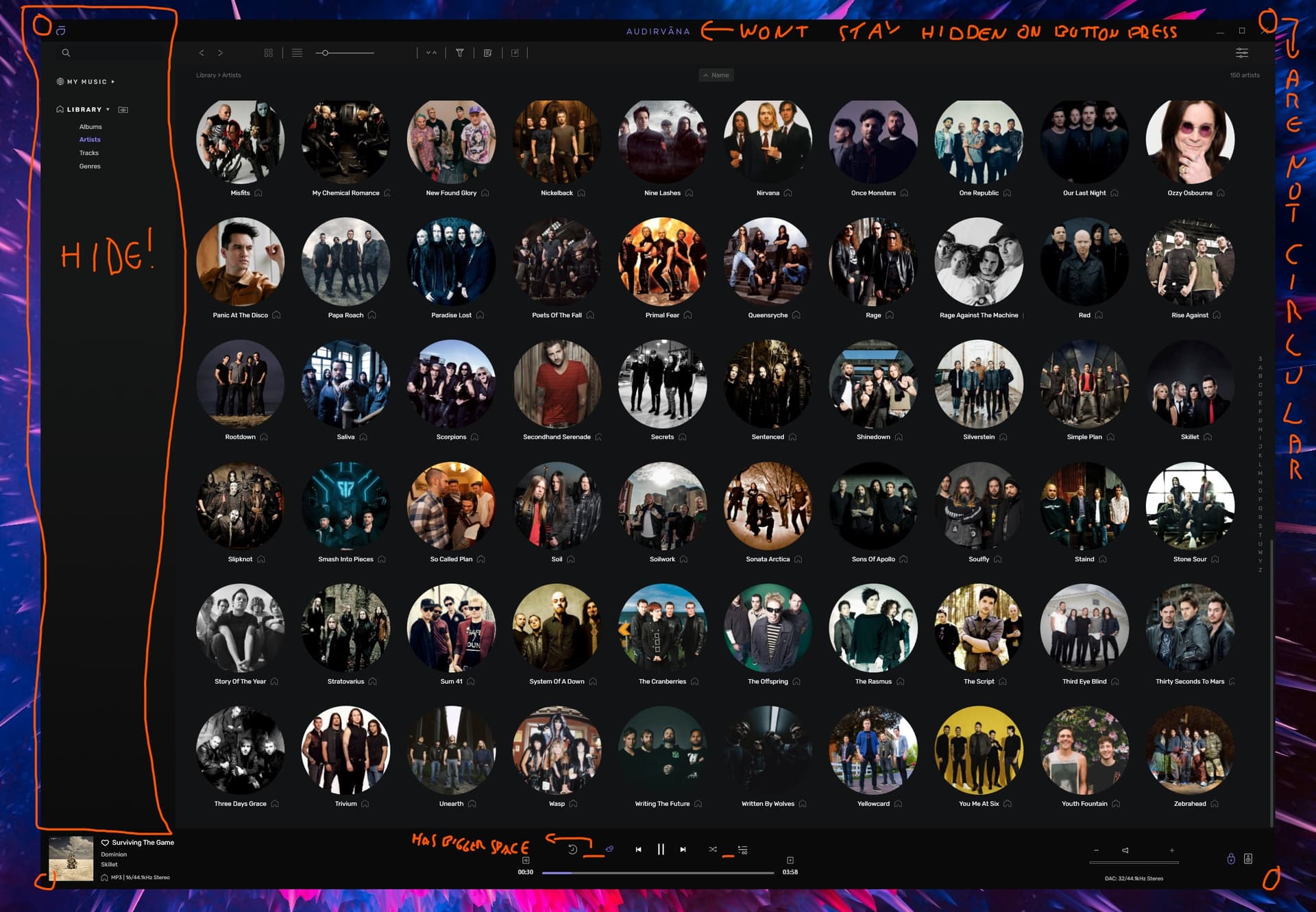
not a great help, but the main library section could be hide at least half of it
or stretched for larger also… put your mouse on the line to see the handle.
I too have to remove the Audirvana logo in the middle of main window every time i start the app ![]() (me, the purple colour choice is not my best).
(me, the purple colour choice is not my best).
1 Like
on MAC the corner seems round for me…
but then i see a little my desktop?? so, should they be squared? ![]()
make my picture bigger to see. that is maybe little things tough to managed when you are on 2 platforms management?
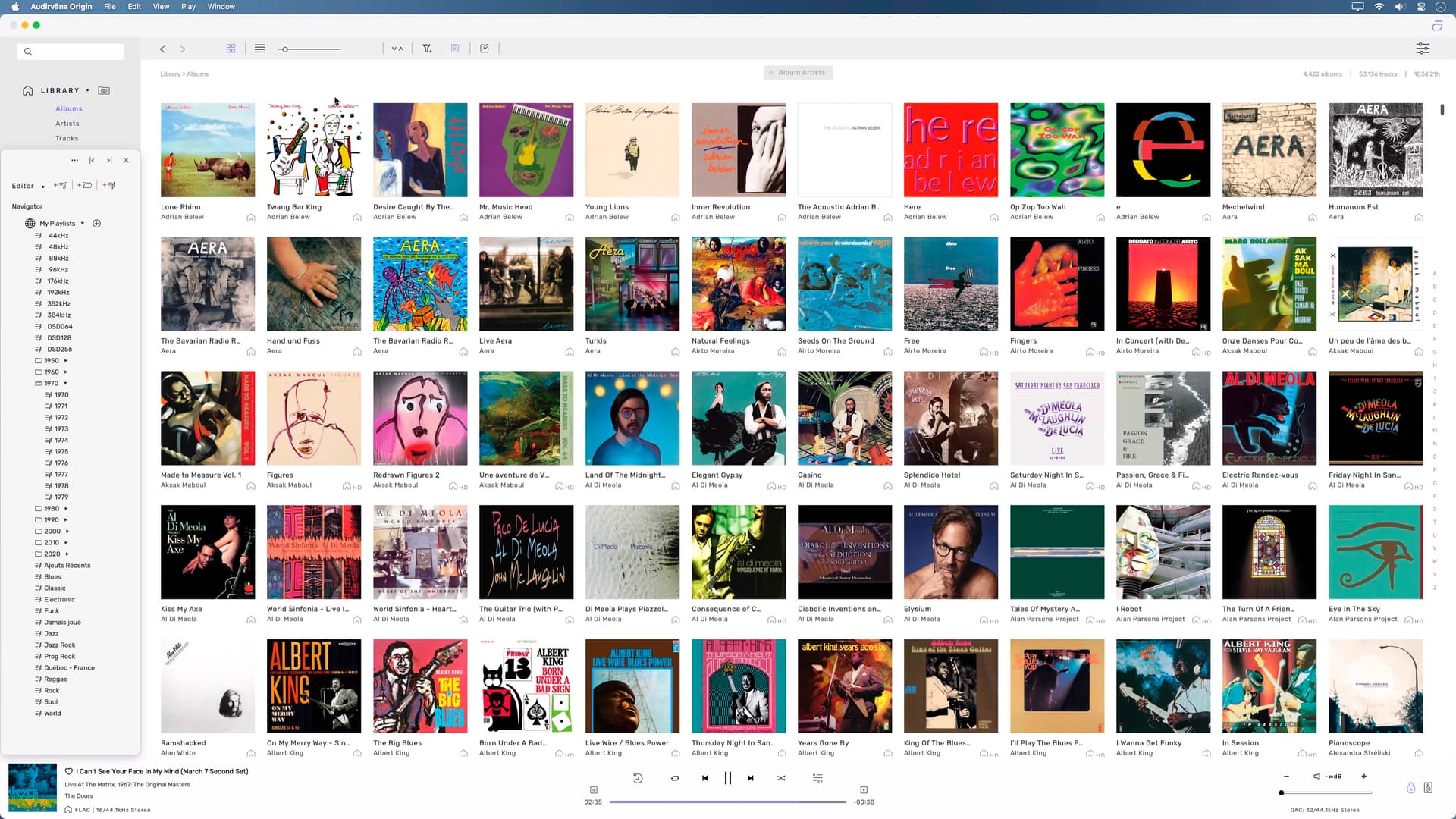
i really prefer to manage my Artists with some filters like albums… First to last, not only last to first option!!
Edit: forgot remove the ‘‘See All’’ button, see them all always please ![]()
1 Like
yes two platforms management need diferent tweaks, sadly ver 2.5.0 didnt fix those still…
Hi @JohnnyFire,
I’m aware of the UI misalignment you are talking about. We couldn’t look at them for this update but we will do this for the next update ![]()
1 Like
thats why i love you! ![]()
and if its posible to fix the mini player when you maximize it and then restore it stays the same size, not the actual one. mostly the miniplayer has ui issues please take a look at it too if you may!