1 Like
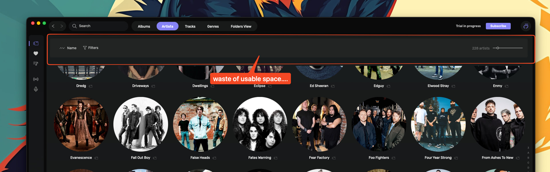
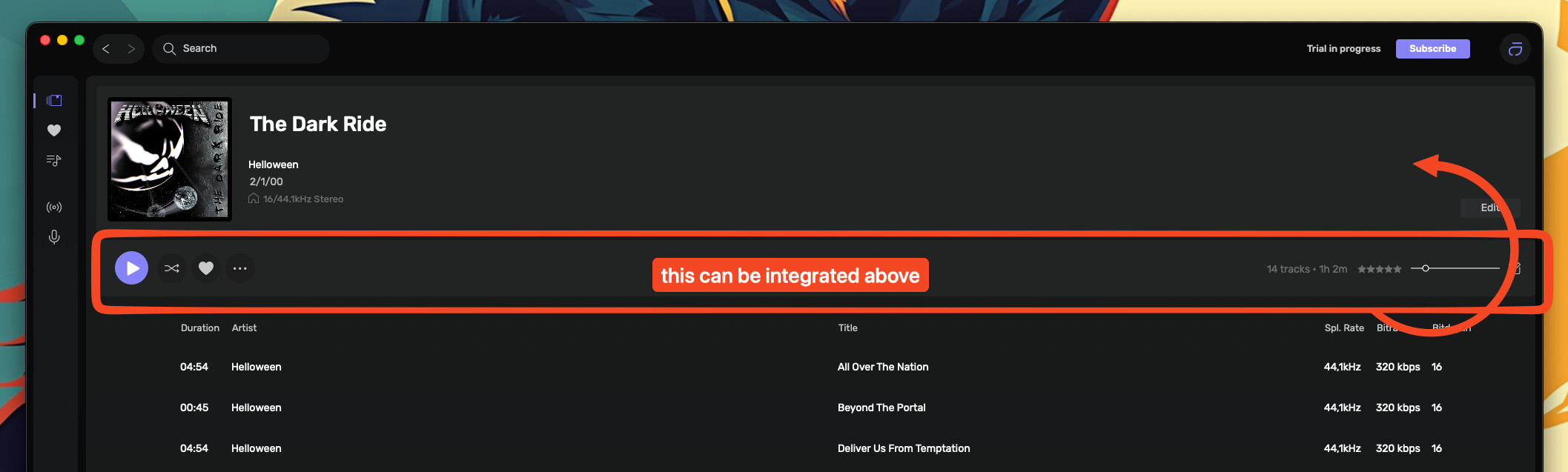
The top space is where I would like to see the top menu all the time. Currently, to get to Recently Added needs a couple of clicks. No real big deal but could be smoother.
Phil
1 Like
indeed can be even better or an option to customize it