Spot on @Sailor about not having the Credits Link on the Album Cover. I have said the same thing through the Test Flight app reporting. Suggested it be added to the 3 Dot Menu.
I have suggested a no of things that obviously get back to Devs, but they don’t get posted here..
@Antoine is there a way for recommendations/issues reported by users using the Test Flight app reporting to be summarised here, so that we can see all issues raised by users as some may not use particular features that others do. Thanks .
Yes when I downloaded the Beta and started using it the screenshot came up with the option to Report through Test Flight and it was just an easy way to report issues or things that I thought could be different and it was only when @Antoine asked me something that I realised it wasn’t on here for everyone to see, but it does get to them.
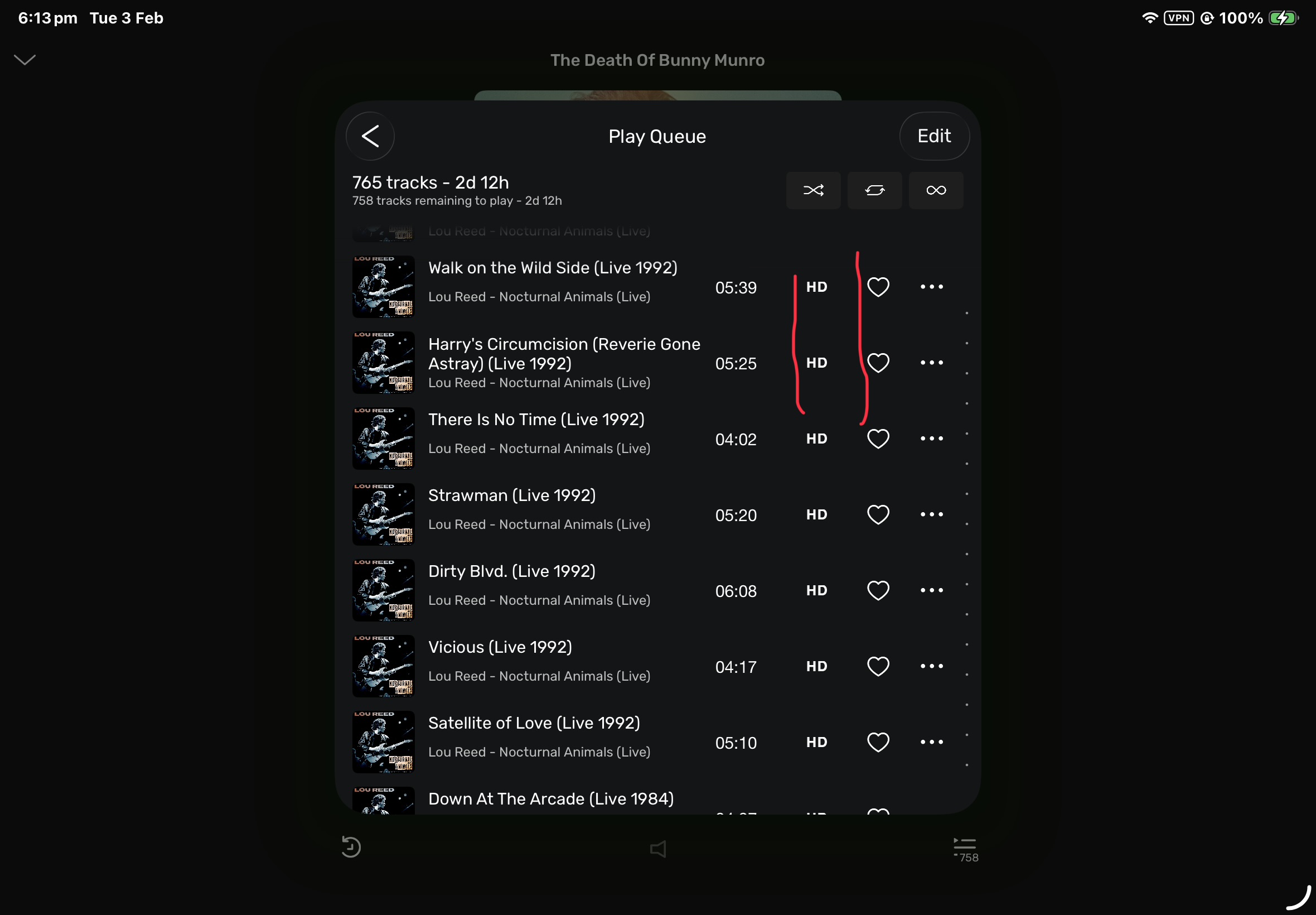
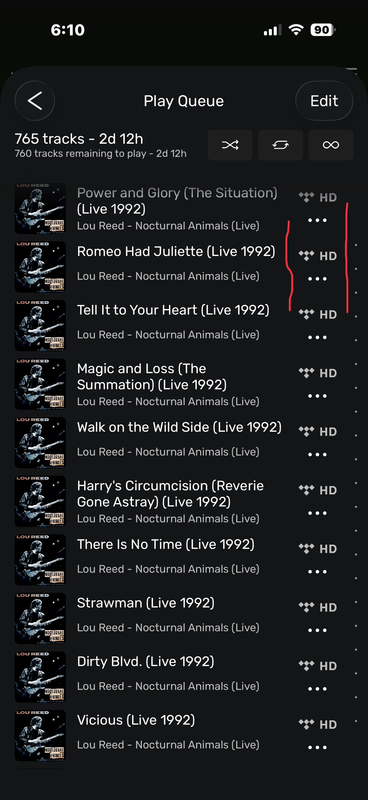
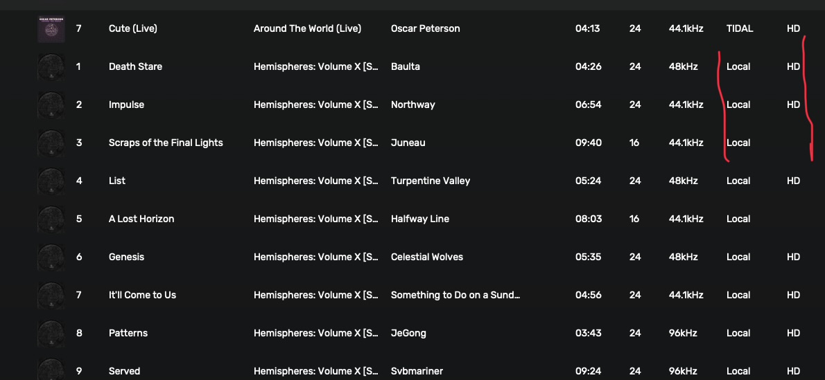
Hi @Antoine I attached 3 Screenshots of Mac App, iPhone and iPad all just in relation to the Information regarding Source & HD/or not.
As you can see the iPad App seems to truncated in that Column and is only showing the HD, without the source. It is on the iPhone and I would have thought there is plenty of room for the iPad.
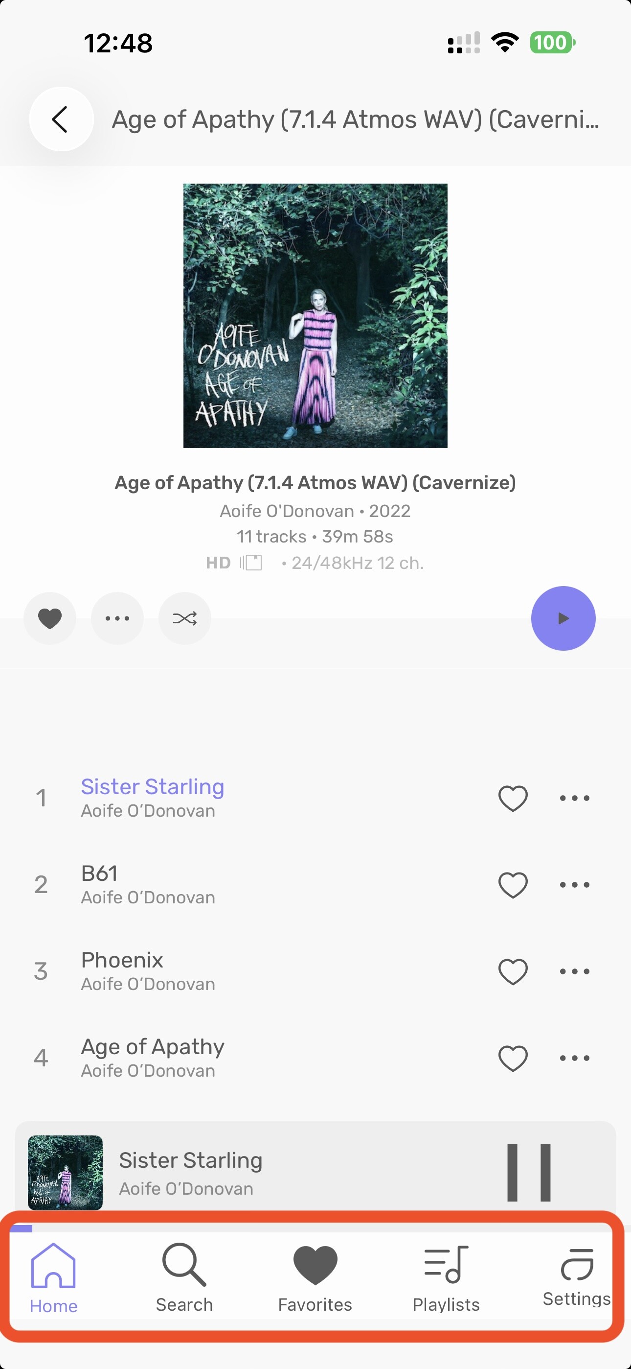
One of the issues i reported on the Test Flight App is that in the new IOS Apps you are unable to increase or decrease the size of the Album Art to get more or less Albums into Local/Favourites or Playlist Screens.
In the apps at the moment It is currently fixed depending on Portrait or Landscape Mode.
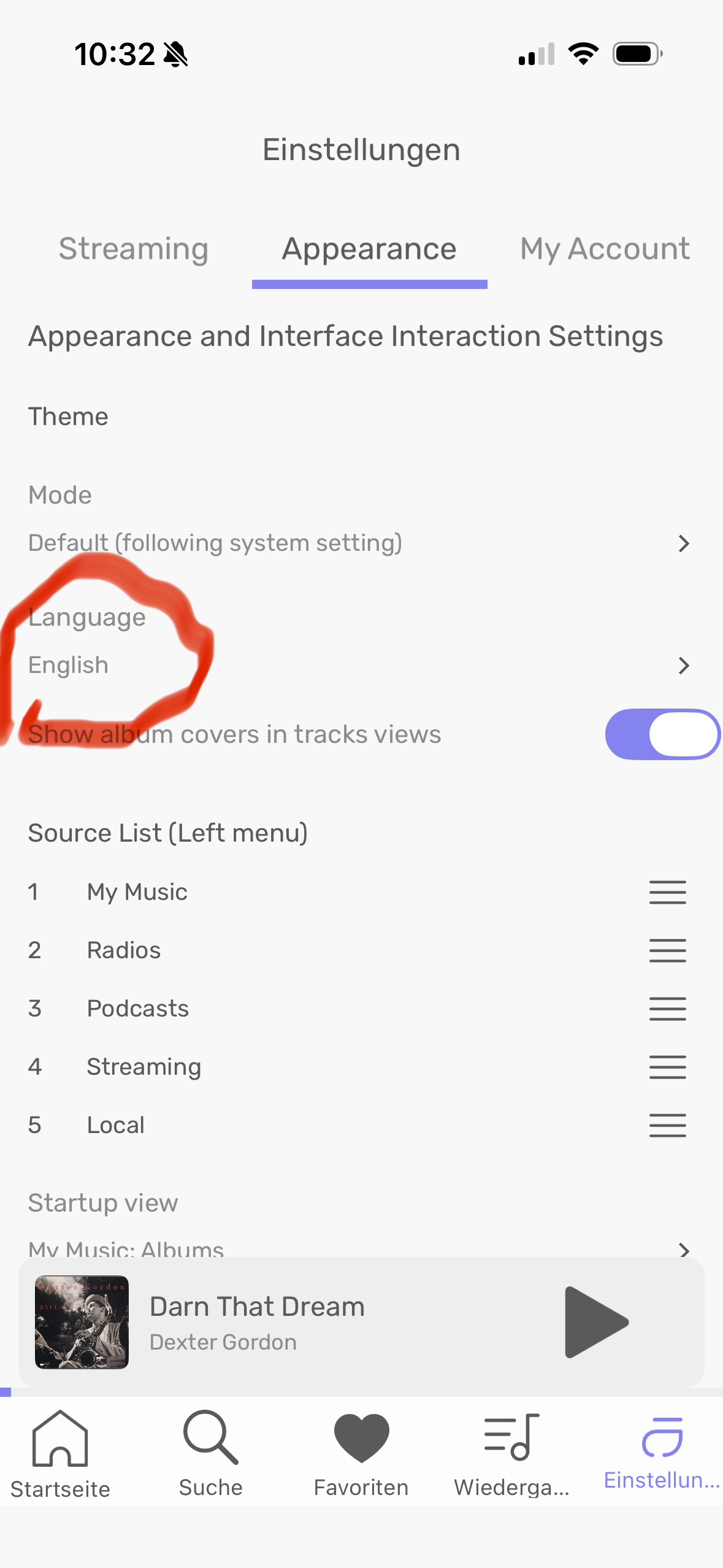
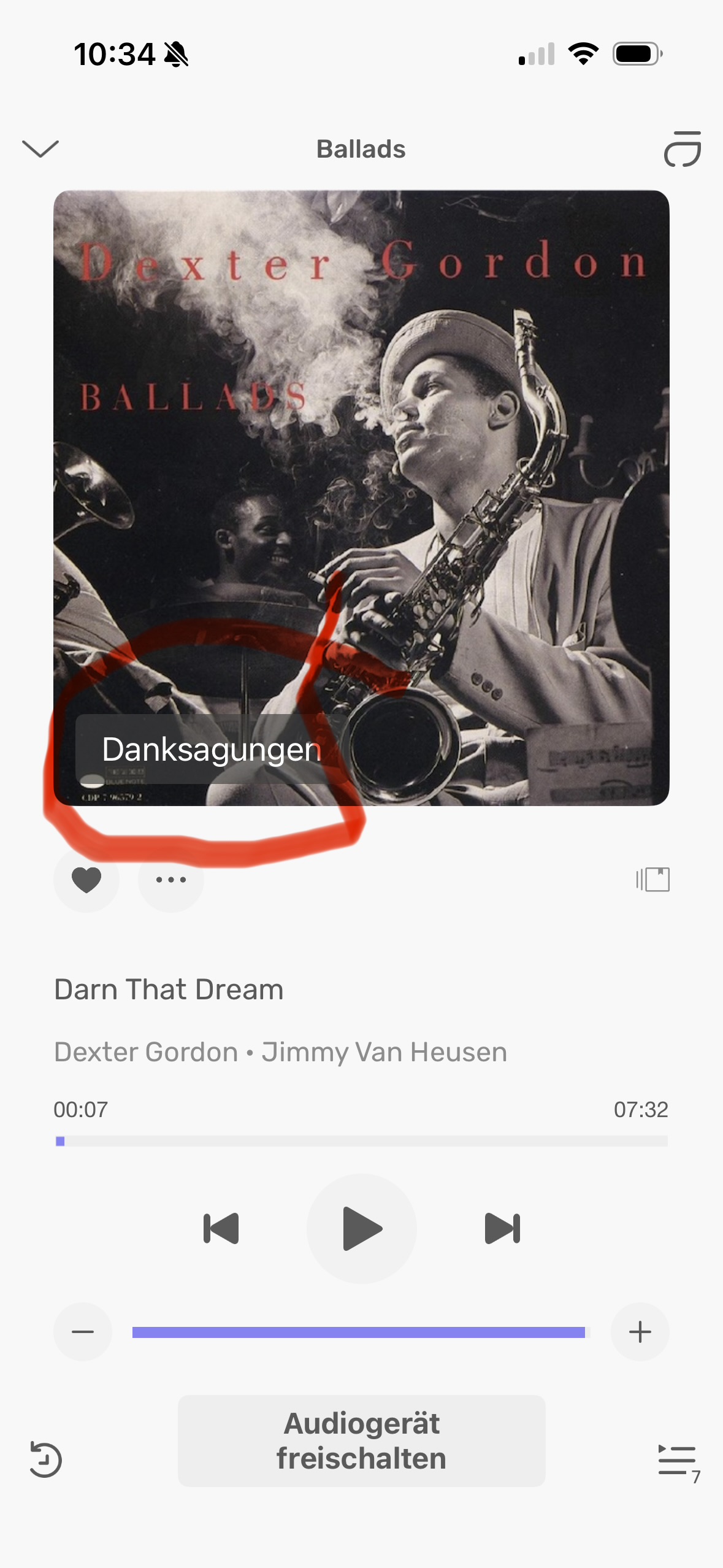
„Credits“ would be perfect. „Danksagung“ is something you say at funerals… Andyes, please, replace the bar by something else, as suggested by @ChiliHot, by three dots. Or at least by something less disturbing.
And yes, even though the language is set to English, the German translation prevails (see attached pictures). Perhaps because the language on my iPhone is set to German?
Not quite sure what you mean: you’d leave away the credits bar, but tapping onto the cover would automatically open the credits, like album artist, performer, composer, etc?
I think that option of tapping the cover to get to the credits and the upsampling information is better than what there is now.
Previously in the old apps, you tapped the Cover to get a much larger Cover photo, but I’ve already got use to going to the dots, tap view album, tap the cover to do that.
The iOS app is really nice and working great for me. My only complaint is that the Favorites heart is filled in, rather than an outline like all the other links at the bottom. This makes me think I am focused on the Favorites every time I look at the app, and I click/tap on another location only to find out I’m already there.
Yes, this is something I would eventually learn, but given how busy our lives are with digital interfaces everywhere, it would be nice if I didn’t have to learn anything to understand the navigation.
I’m testing the app on my iPad now. Scrolling through albums isn’t smooth at all. When I scroll the screen jumps and appears to reload a bunch of albums. I have a screen recording of it, but the forum doesn’t allow uploads of videos.